

Working with Unlabeled Data — Clustering Analysis
Prework
Import essentials
from IPython.display import Image
%matplotlib inline
Check package version (optional)
Add folder to path in order to load from the check_packages.py script.
import sys
sys.path.insert(0, '..')
Check recommended package versions.
# Package version check (Colab-safe: no external script required)
import importlib

def check_packages(d):
    for pkg_name, min_version in d.items():
        try:
            imported = importlib.import_module(pkg_name)
            version = getattr(imported, '__version__', 'unknown')
            print(f'[OK] {pkg_name} {version}')
        except ImportError:
            print(f'[MISSING] {pkg_name} is not installed')

d = {
    'numpy': '1.21.2',
    'scipy': '1.7.0',
    'matplotlib': '3.4.3',
    'sklearn': '1.0',
    'pandas': '1.3.2',
}
check_packages(d)
[OK] numpy 2.0.2
[OK] scipy 1.16.3
[OK] matplotlib 3.10.0
[OK] sklearn 1.6.1
[OK] pandas 2.2.2
Watermark (optional)
Optional watermark extension is a small IPython notebook plugin that I developed to make the code reproducible.
You can install watermark Jupyter extension via
conda install watermark -c conda-forge or
pip install watermark For more information, please see: https://
# 'watermark' is not preinstalled on Colab, so install it first if needed
import importlib
if importlib.util.find_spec('watermark') is None:
    %pip install -q watermark

%load_ext watermark
%watermark -a "Sebastian Raschka, Johnny Yu" -u -d -v -p numpy,pandas,matplotlib,scipy,sklearn
   ━━━━━━━━━━━━━━━━━━━━━━━━━━━━━━━━━━━━━━━━ 4.9/4.9 MB 23.8 MB/s eta 0:00:00
Author: Sebastian Raschka, Johnny Yu

Last updated: 2026-08-13

Python implementation: CPython
Python version       : 3.12.13
IPython version      : 7.34.0

numpy     : 2.0.2
pandas    : 2.2.2
matplotlib: 3.10.0
scipy     : 1.16.3
sklearn   : 1.6.1
Table of Contents
10.1.Grouping objects by similarity using k-means
10.1.1.K-means clustering using scikit-learn
The 150 randomly generated points that are roughly grouped into three regions and two dimensions with higher density.
from sklearn.datasets import make_blobs


X, y = make_blobs(n_samples=150,      # 150 randomly generated points
                  n_features=2,       # 2 inputs (dimension)
                  centers=3,          # 3 clusters (region)
                  cluster_std=0.5,    # density of samples
                  shuffle=True,
                  random_state=0)
Visualize the dataset in a scatter plot.
import matplotlib.pyplot as plt


plt.scatter(X[:, 0], X[:, 1],
            c='white', marker='o', edgecolor='black', s=50)
plt.xlabel('Feature 1')
plt.ylabel('Feature 2')

plt.grid()
plt.tight_layout()
#plt.savefig('figures/10_01.png', dpi=300)
plt.show()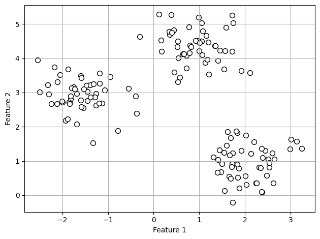
Apply k-means algorithm to our example dataset using the KMeans class from scikit-learn’s cluster module.
Problem: large max_iter
It is possible that k-means does not reach convergence for a particular run, which can be problematic (computationally expensive) if we choose relatively large values for max_iter.
Solution: large tol
One way to deal with convergence problems is to choose larger values for tol, which is a parameter that controls the tolerance with regard to the changes in the within-cluster SSE to declare convergence. In the preceding code, we chose a tolerance of 1e-04 (=0.0001).
from sklearn.cluster import KMeans


km = KMeans(n_clusters=3,       # specify the number of clusters a priori
            init='random',      # default is 'k-means++'
            n_init=10,          # run algorithms 10 times independently
            max_iter=300,
            tol=1e-04,
            random_state=0)

y_km = km.fit_predict(X)        # predicted cluster labels
Visualize the clusters that k-means identified in the dataset together with the cluster centroids. These are stored under the cluster_centers_ attribute of the fitted KMeans object.
plt.scatter(X[y_km == 0, 0],                # cluster 1
            X[y_km == 0, 1],
            s=50, c='lightgreen',
            marker='s', edgecolor='black',
            label='Cluster 1')
plt.scatter(X[y_km == 1, 0],                # cluster 2
            X[y_km == 1, 1],
            s=50, c='orange',
            marker='o', edgecolor='black',
            label='Cluster 2')
plt.scatter(X[y_km == 2, 0],                # cluster 3
            X[y_km == 2, 1],
            s=50, c='lightblue',
            marker='v', edgecolor='black',
            label='Cluster 3')
plt.scatter(km.cluster_centers_[:, 0],      # centroids
            km.cluster_centers_[:, 1],
            s=250, marker='*',
            c='red', edgecolor='black',
            label='Centroids')

plt.xlabel('Feature 1')
plt.ylabel('Feature 2')

plt.legend(scatterpoints=1)
plt.grid()
plt.tight_layout()
#plt.savefig('figures/10_02.png', dpi=300)
plt.show()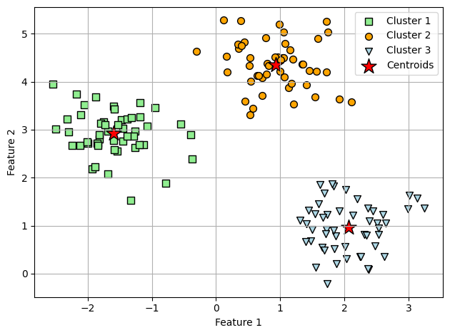
10.1.2.A smarter way of placing the initial cluster centroids using k-means++
To use k-means++ with scikit-learn’s KMeans object, we just need to set the init parameter to 'k-means++', which is strongly recommended in practice.
10.1.3.Hard versus soft clustering
Unfortunately, the FCM algorithm is not implemented in scikit-learn currently, but interested readers can try out the FCM implementation from the scikit-fuzzy package, which is available at https://
10.1.4.Using the elbow method to find the optimal number of clusters
Conveniently, we don’t need to compute the within-cluster SSE explicitly when we are using scikit-learn, as it is already accessible via the inertia_attribute after fitting a KMeans model.
From previous k-means result, we have the following distortion:
print(f'Distortion: {km.inertia_:.2f}')Distortion: 72.48
Based on the within-cluster SSE, we can use elbow method to estimate the optimal number of clusters k for a given task. And recall that the lower value of inertia (= lesser distortion) indicates better clustering.
In the following plot, the elbow is located at k = 3, so this is supporting evidence that k = 3 is a good choice for this dataset.
# Calculate distortions with different number of clusters k
distortions = []
for i in range(1, 11):
    km = KMeans(n_clusters=i,
                init='k-means++',
                n_init=10,
                max_iter=300,
                random_state=0)
    km.fit(X)                                    # fit kmeans algorithm to data for training
    distortions.append(km.inertia_)

# Visualize
plt.plot(range(1, 11), distortions, marker='o')
plt.xlabel('Number of clusters')
plt.ylabel('Distortion')
plt.tight_layout()
#plt.savefig('figures/10_03.png', dpi=300)
plt.show()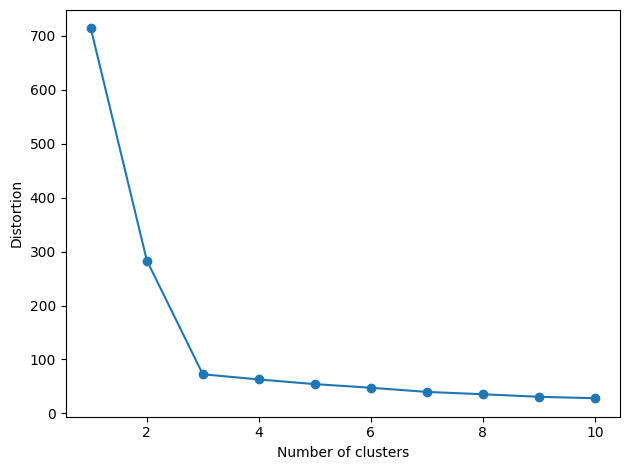
10.1.5.Quantifying the quality of clustering via silhouette plots
The silhouette coefficient is available as silhouette_samples from scikit-learn’s metric module, and optionally, the silhouette_scores function can be imported for convenience. The silhouette_scores function calculates the average silhouette coefficient across all examples, which is equivalent to numpy.mean(silhouette_samples(...)).
There are two examples in the following sections: good and bad clustering.
1) Ex: good clustering (three centroids)
Silhouette coefficients are not close to 0
Silhouette coefficients are approximately equally far away from the average silhouette coefficients (dotted line in the following figure)
import numpy as np
from matplotlib import cm
from sklearn.metrics import silhouette_samples

# K-means clustering (3 clusters)
km = KMeans(n_clusters=3,
            init='k-means++',
            n_init=10,
            max_iter=300,
            tol=1e-04,
            random_state=0)
y_km = km.fit_predict(X)

# Calculate silhouette coefficient (values)
cluster_labels = np.unique(y_km)
n_clusters = cluster_labels.shape[0]
silhouette_vals = silhouette_samples(X, y_km, metric='euclidean')
y_ax_lower, y_ax_upper = 0, 0
yticks = []
for i, c in enumerate(cluster_labels):
    c_silhouette_vals = silhouette_vals[y_km == c]
    c_silhouette_vals.sort()
    y_ax_upper += len(c_silhouette_vals)
    color = cm.jet(float(i) / n_clusters)
    plt.barh(range(y_ax_lower, y_ax_upper), c_silhouette_vals, height=1.0,
             edgecolor='none', color=color)

    yticks.append((y_ax_lower + y_ax_upper) / 2.)
    y_ax_lower += len(c_silhouette_vals)

# Calculate average silhouette value (red dotted line in plot)
silhouette_avg = np.mean(silhouette_vals)
plt.axvline(silhouette_avg, color="red", linestyle="--")

# Silhouette plot
plt.yticks(yticks, cluster_labels + 1)
plt.ylabel('Cluster')
plt.xlabel('Silhouette coefficient')
plt.tight_layout()
#plt.savefig('figures/10_04.png', dpi=300)
plt.show()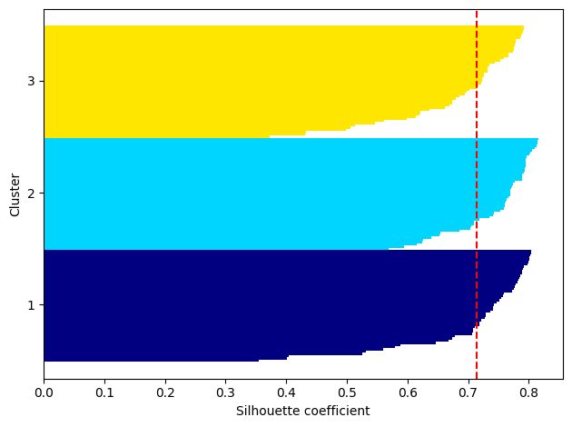
2.1) Ex: bad clustering (two centroids) scatter plot
One of the centroids falls between two of the three spherical groupings of the input data.
# K-means clustering (2 clusters)
km = KMeans(n_clusters=2,
            init='k-means++',
            n_init=10,
            max_iter=300,
            tol=1e-04,
            random_state=0)
y_km = km.fit_predict(X)

# Scatter plot
plt.scatter(X[y_km == 0, 0],
            X[y_km == 0, 1],
            s=50,
            c='lightgreen',
            edgecolor='black',
            marker='s',
            label='Cluster 1')
plt.scatter(X[y_km == 1, 0],
            X[y_km == 1, 1],
            s=50,
            c='orange',
            edgecolor='black',
            marker='o',
            label='Cluster 2')

plt.scatter(km.cluster_centers_[:, 0], km.cluster_centers_[:, 1],
            s=250, marker='*', c='red', label='Centroids')

plt.xlabel('Feature 1')
plt.ylabel('Feature 2')

plt.legend()
plt.grid()
plt.tight_layout()
#plt.savefig('figures/10_05.png', dpi=300)
plt.show()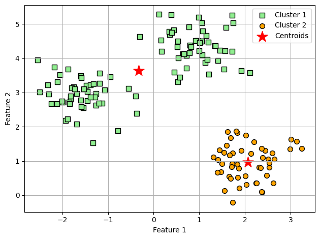
2.2) Ex: bad clustering (two centroids) silhouette plot
Typically we don’t have the luxury of visualizing datasets in two-dimensional scatterplots in real-world problems (data in higher dimensions). Thus, it’s better for to use silhouette plot for evaluating the clustering results.
Silhouette coefficient of cluster 2 is closer to 0
Silhouette coefficients are not equally far away from the average silhouette coefficients (dotted line in the following figure)
# Calculate average silhouette value (red dotted line in plot)
cluster_labels = np.unique(y_km)
n_clusters = cluster_labels.shape[0]
silhouette_vals = silhouette_samples(X, y_km, metric='euclidean')
y_ax_lower, y_ax_upper = 0, 0
yticks = []
for i, c in enumerate(cluster_labels):
    c_silhouette_vals = silhouette_vals[y_km == c]
    c_silhouette_vals.sort()
    y_ax_upper += len(c_silhouette_vals)
    color = cm.jet(float(i) / n_clusters)
    plt.barh(range(y_ax_lower, y_ax_upper), c_silhouette_vals, height=1.0,
             edgecolor='none', color=color)

    yticks.append((y_ax_lower + y_ax_upper) / 2.)
    y_ax_lower += len(c_silhouette_vals)

# Calculate average silhouette value (red dotted line in plot)
silhouette_avg = np.mean(silhouette_vals)
plt.axvline(silhouette_avg, color="red", linestyle="--")

# Silhouette plot
plt.yticks(yticks, cluster_labels + 1)
plt.ylabel('Cluster')
plt.xlabel('Silhouette coefficient')
plt.tight_layout()
#plt.savefig('figures/10_06.png', dpi=300)
plt.show()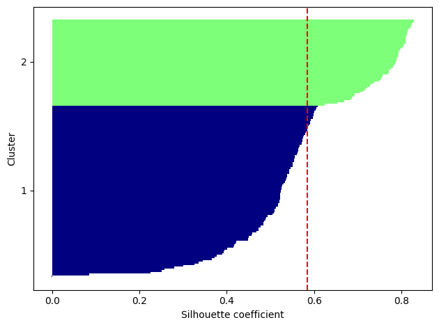
10.2.Organizing clusters as a hierarchical tree
10.2.1.Grouping clusters in bottom-up fashion
import os, urllib.request
os.makedirs('figures', exist_ok=True)
fig_path = 'figures/10_07.png'
if not os.path.exists(fig_path):
    url = 'https://raw.githubusercontent.com/rasbt/machine-learning-book/main/ch10/figures/10_07.png'
    try:
        urllib.request.urlretrieve(url, fig_path)
    except Exception as e:
        print(f'Could not download figure: {e}')
if os.path.exists(fig_path):
    display(Image(filename=fig_path, width=400))
Generate a random data sample.
rows: different observations (IDs 0-4)
columns: different features (X, Y, Z) of those examples
import pandas as pd
import numpy as np


np.random.seed(123)

variables = ['X', 'Y', 'Z']
labels = ['ID_0', 'ID_1', 'ID_2', 'ID_3', 'ID_4']

X = np.random.random_sample([5, 3])*10
df = pd.DataFrame(X, columns=variables, index=labels)
df10.2.2.Performing hierarchical clustering on a distance matrix
Create a condensed distance matrix as input for the hierarchical clustering algorithm by pdist function from SciPy’s spatial.distance submodule. And use squareform function to create a symmetrical pairwise distance matrix, shown in the following result.
from scipy.spatial.distance import pdist, squareform


# Calculate Euclidean distance
row_dist = pd.DataFrame(squareform(pdist(df, metric='euclidean')),
                        columns=labels,
                        index=labels)
row_distWe can either pass a condensed distance matrix (upper triangular) from the pdist function, or we can pass the “original” data array and define the metric='euclidean' argument in linkage function in the following code. However, we should not pass the squareform distance matrix, which would yield different distance values although the overall clustering could be the same.
To sum it up, the three possible scenarios are listed here:
incorrect approach: Squareform distance matrix
correct approach: Condensed distance matrix
correct approach: Input matrix
# 1. incorrect approach: Squareform distance matrix

from scipy.cluster.hierarchy import linkage


row_clusters = linkage(row_dist, method='complete', metric='euclidean')
pd.DataFrame(row_clusters,
             columns=['row label 1', 'row label 2',
                      'distance', 'no. of items in clust.'],
             index=[f'cluster {(i + 1)}'
                    for i in range(row_clusters.shape[0])])
/tmp/ipykernel_964/1052818803.py:6: ClusterWarning: The symmetric non-negative hollow observation matrix looks suspiciously like an uncondensed distance matrix
row_clusters = linkage(row_dist, method='complete', metric='euclidean')
# 2. correct approach: Condensed distance matrix

row_clusters = linkage(pdist(df, metric='euclidean'), method='complete')
pd.DataFrame(row_clusters,
             columns=['row label 1', 'row label 2',
                      'distance', 'no. of items in clust.'],
            index=[f'cluster {(i + 1)}'
for i in range(row_clusters.shape[0])])# 3. correct approach: Input matrix
row_clusters = linkage(df.values, method='complete', metric='euclidean')
pd.DataFrame(row_clusters,
columns=['row label 1', 'row label 2',
'distance', 'no. of items in clust.'],
index=[f'cluster {(i + 1)}'
for i in range(row_clusters.shape[0])])To take a closer look at the clustering results, we can turn those results into a pandas DataFrame as the following code.
As shown in the following result, the linkage matrix consists of several rows where each row represents one merge.
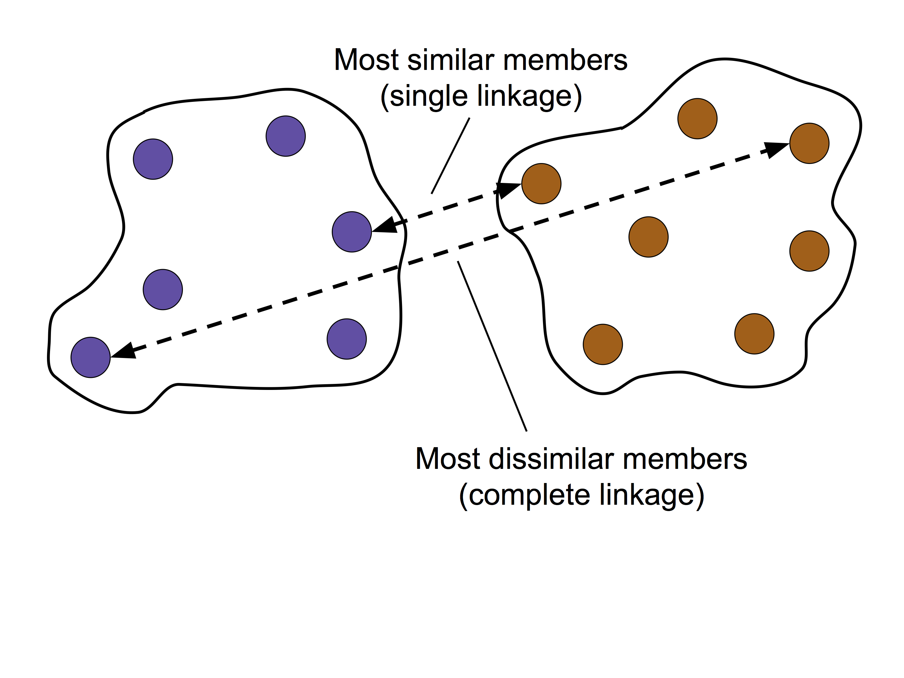
The first and second columns denote the most dissimilar members in each cluster
The third column reports the distance between those members
The last column returns the count of the members in each cluster
pd.DataFrame(row_clusters,
columns=['row label 1',
'row label 2',
'distance',
'no. of items in clust.'],
index=[f'cluster {(i + 1)}' for i in
range(row_clusters.shape[0])])
Now that we have computed the linkage matrix, we can visualize the results in the form of a dendrogram.
Such a dendrogram summarizes the different clusters that were formed during the agglomerative hierarchical clustering; for example, you can see that the examples ID_0 and ID_4, followed by ID_1 and ID_2, are the most similar ones based on the Euclidean distance metric.
from scipy.cluster.hierarchy import dendrogram


# make dendrogram black (part 1/2)
# from scipy.cluster.hierarchy import set_link_color_palette
# set_link_color_palette(['black'])

row_dendr = dendrogram(row_clusters,
                       labels=labels,
                       # make dendrogram black (part 2/2)
                       # color_threshold=np.inf
                       )
plt.tight_layout()
plt.ylabel('Euclidean distance')
#plt.savefig('figures/10_11.png', dpi=300,
#            bbox_inches='tight')
plt.show()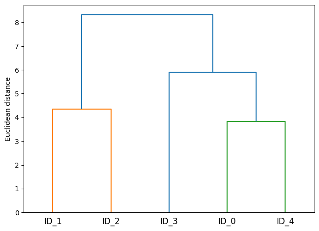
10.2.3.Attaching dendrograms to a heat map
Attach a dendrogram to a heat map with the following steps:
Create a new figure object and define the x-axis position, y-axis position, width, and height of the dendrogram via the
add_axesattribute. Furthermore, we rotate the dendrogram 90 degrees counterclockwise.Reorder the data in our initial
DataFrameaccording to the clustering labels that can be accessed from the dendrogram object, which is essentially a Python dictionary, via the leaves key.Modify the aesthetics of the dendrogram by removing the axis ticks and hiding the axis spines.
Construct the heat map from the reordered
DataFrameand position it next to the dendrogram.Add a color bar and assign the feature and data record names to the x and y axis tick labels.
# 1. Plot row dendrogram
fig = plt.figure(figsize=(8, 8), facecolor='white')
axd = fig.add_axes([0.09, 0.1, 0.2, 0.6])                 # define the attributes of the dendrogram
row_dendr = dendrogram(row_clusters, orientation='left')  # note: for matplotlib < v1.5.1, use orientation='right'

# 2. Reorder data with respect to clustering
df_rowclust = df.iloc[row_dendr['leaves'][::-1]]
axd.set_xticks([])
axd.set_yticks([])

# 3. Remove axes spines from dendrogram
for i in axd.spines.values():
    i.set_visible(False)

# 4. Construct and place heatmap
axm = fig.add_axes([0.23, 0.1, 0.6, 0.6])  # x-pos, y-pos, width, height
cax = axm.matshow(df_rowclust, interpolation='nearest', cmap='hot_r')

# 5. Plot heatmap
fig.colorbar(cax)
axm.set_xticks(range(len(df_rowclust.columns) + 1))
axm.set_xticklabels([''] + list(df_rowclust.columns))
axm.set_yticks(range(len(df_rowclust.index) + 1))
axm.set_yticklabels([''] + list(df_rowclust.index))
#plt.savefig('figures/10_12.png', dpi=300)
plt.show()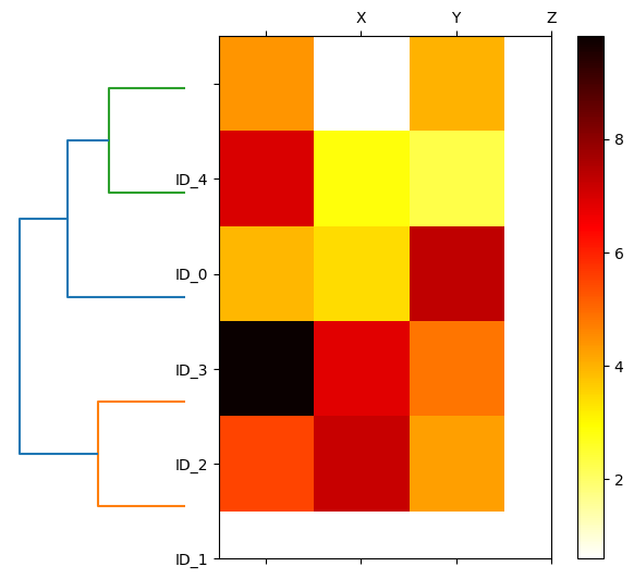
10.2.4.Applying agglomerative clustering via scikit-learn
This AgglomerativeClustering function in scikit-learn allows us to choose the number of clusters that we want to return, which is useful if we want to prune the hierarchical cluster tree.
In this case, we set number of clusters as n_clusters=3
From the result Cluster labels: [1 0 0 2 1], first entity in the vector represents ID_0 belongs to label 1, vice versa. With such, we can read the result Cluster labels: [1 0 0 2 1] as follows:
ID_0 and ID_4 belongs to label 1
ID_1 and ID_2 belongs to label 0
ID_3 belongs to label 2
from sklearn.cluster import AgglomerativeClustering


ac = AgglomerativeClustering(n_clusters=3,
                             metric='euclidean',
                             linkage='complete')
labels = ac.fit_predict(X)
print(f'Cluster labels: {labels}')
Cluster labels: [1 0 0 2 1]
Now, change number of clusters to n_clusters=2, we can see that
ID_0, ID_3 and ID_4 belongs to label 0
ID_1 and ID_2 belongs to label 1
ac = AgglomerativeClustering(n_clusters=2,
                             metric='euclidean',
                             linkage='complete')
labels = ac.fit_predict(X)
print(f'Cluster labels: {labels}')
Cluster labels: [0 1 1 0 0]
10.3.Locating regions of high density via DBSCAN
import os, urllib.request
os.makedirs('figures', exist_ok=True)
fig_path = 'figures/10_13.png'
if not os.path.exists(fig_path):
    url = 'https://raw.githubusercontent.com/rasbt/machine-learning-book/main/ch10/figures/10_13.png'
    try:
        urllib.request.urlretrieve(url, fig_path)
    except Exception as e:
        print(f'Could not download figure: {e}')
if os.path.exists(fig_path):
    display(Image(filename=fig_path, width=500))
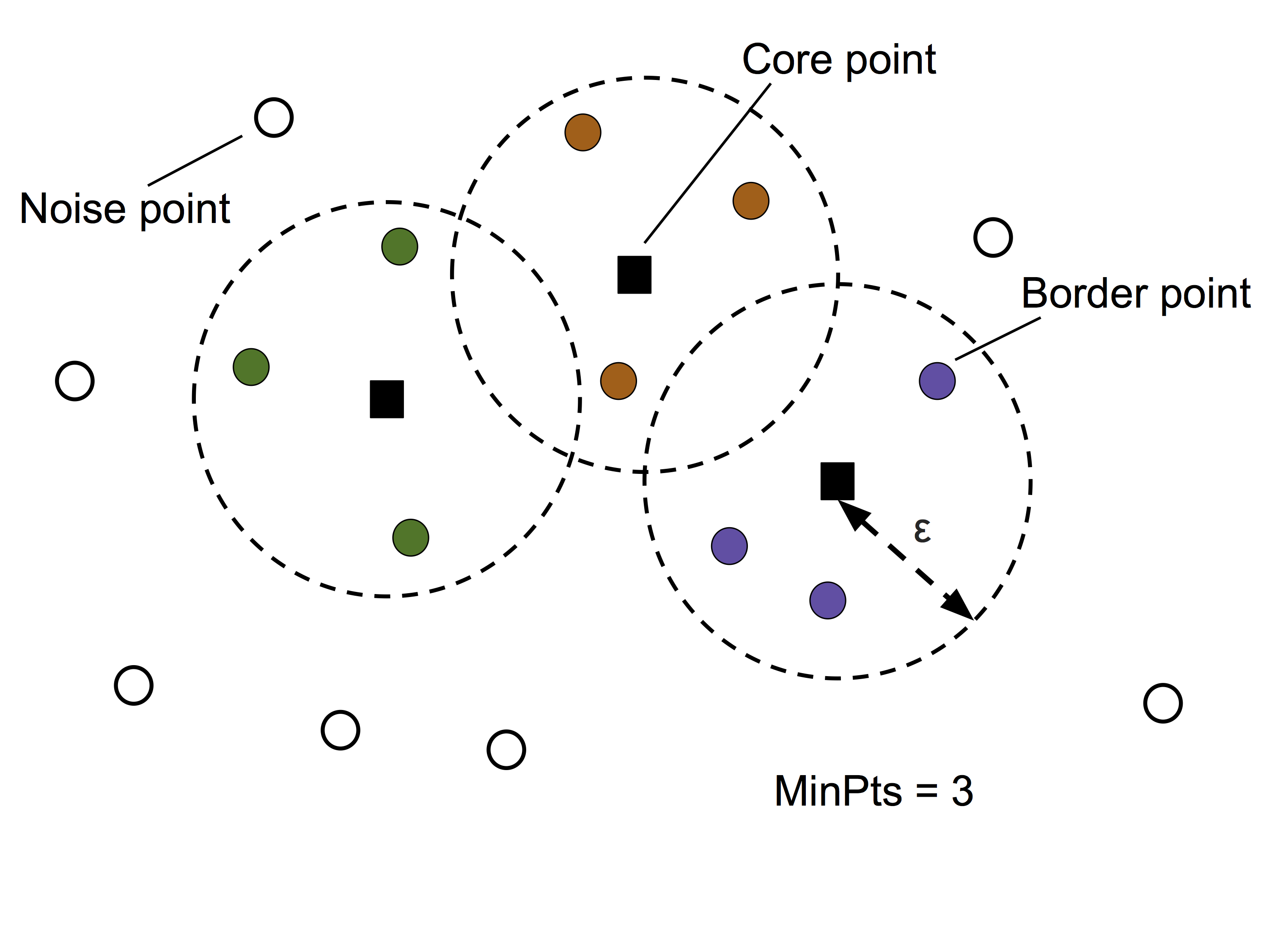
In this section, we will compare three different clustering approaches: k-means, ACL, DBSCAN, with a dataset of half-moon-shaped structures. (recall that ACL = Agglomerative Complete Linkage)
First, let’s create the dataset with the build-in dataset in scikit-learn.
from sklearn.datasets import make_moons


X, y = make_moons(n_samples=200, noise=0.05, random_state=0)
plt.scatter(X[:, 0], X[:, 1])

plt.xlabel('Feature 1')
plt.ylabel('Feature 2')

plt.tight_layout()
#plt.savefig('figures/10_14.png', dpi=300)
plt.show()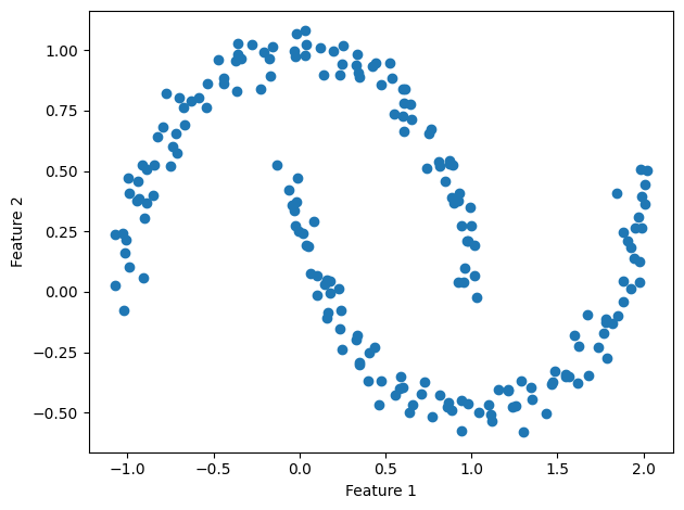
1) K-means and ACL algorithm
Based on the visualized clustering results, we can see that the k-means algorithm was unable to separate the two clusters, and also, the hierarchical clustering algorithm (ACL) was challenged by those complex shapes.
f, (ax1, ax2) = plt.subplots(1, 2, figsize=(8, 3))

# 1. K-means clustering
km = KMeans(n_clusters=2, random_state=0)
y_km = km.fit_predict(X)
ax1.scatter(X[y_km == 0, 0], X[y_km == 0, 1],
            edgecolor='black',
            c='lightblue', marker='o', s=40, label='cluster 1')
ax1.scatter(X[y_km == 1, 0], X[y_km == 1, 1],
            edgecolor='black',
            c='red', marker='s', s=40, label='cluster 2')
ax1.set_title('K-means clustering')
ax1.set_xlabel('Feature 1')
ax1.set_ylabel('Feature 2')

# 2. ACL clustering
ac = AgglomerativeClustering(n_clusters=2,
                             metric='euclidean',
                             linkage='complete')
y_ac = ac.fit_predict(X)
ax2.scatter(X[y_ac == 0, 0], X[y_ac == 0, 1], c='lightblue',
            edgecolor='black',
            marker='o', s=40, label='Cluster 1')
ax2.scatter(X[y_ac == 1, 0], X[y_ac == 1, 1], c='red',
            edgecolor='black',
            marker='s', s=40, label='Cluster 2')
ax2.set_title('Agglomerative clustering (ACL)')
ax2.set_xlabel('Feature 1')
ax2.set_ylabel('Feature 2')

# Plot attributes
plt.legend()
plt.tight_layout()
#plt.savefig('figures/10_15.png', dpi=300)
plt.show()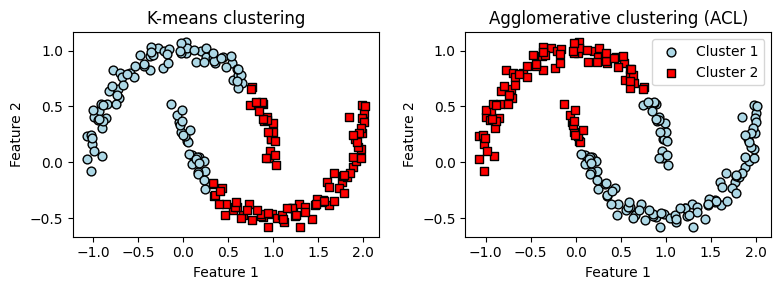
2) DBSCAN
The DBSCAN algorithm can successfully detect the half-moon shapes, which highlights one of the strengths of DBSCAN—clustering data of arbitrary shapes.
from sklearn.cluster import DBSCAN

# 3. DBSCAN clustering
db = DBSCAN(eps=0.2, min_samples=5, metric='euclidean')
y_db = db.fit_predict(X)
plt.scatter(X[y_db == 0, 0], X[y_db == 0, 1],
            c='lightblue', marker='o', s=40,
            edgecolor='black',
            label='Cluster 1')
plt.scatter(X[y_db == 1, 0], X[y_db == 1, 1],
            c='red', marker='s', s=40,
            edgecolor='black',
            label='Cluster 2')
plt.xlabel('Feature 1')
plt.ylabel('Feature 2')

# Plot attributes
plt.legend()
plt.tight_layout()
#plt.savefig('figures/10_16.png', dpi=300)
plt.show()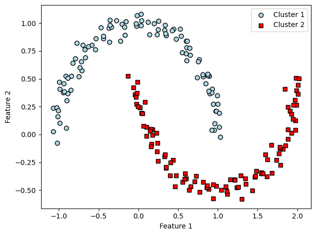
Readers may ignore the next cell.
# Optional utility script from the book's own repo (not included here) that
# converts this notebook to a .py file. Skipped safely when not present.
import os
script = '../.convert_notebook_to_script.py'
if os.path.exists(script):
    get_ipython().system('python {script} --input ch10-UWFLecture.ipynb --output ch10-UWFLecture.py')
else:
    print('Skipping: convert_notebook_to_script.py not present in this environment.')
Skipping: convert_notebook_to_script.py not present in this environment.