

Compressing Data via Dimensionality Reduction
Package version checks
Add folder to path in order to load from the check_packages.py script:
# (Removed local-repo sys.path hack; not needed on Colab.)
Check recommended package versions:
# Report installed package versions (no external helper script needed on Colab).
import importlib.metadata as importlib_metadata

for pkg in ['numpy', 'matplotlib', 'scikit-learn', 'pandas']:
    try:
        print(f'{pkg}: {importlib_metadata.version(pkg)}')
    except importlib_metadata.PackageNotFoundError:
        print(f'{pkg}: NOT INSTALLED')
numpy: 2.0.2
matplotlib: 3.10.0
scikit-learn: 1.6.1
pandas: 2.2.2
Chapter 5 - Compressing Data via Dimensionality Reduction
Overview
from IPython.display import Image
%matplotlib inline

import os
os.makedirs('figures', exist_ok=True)  # so plt.savefig(...) calls below don't fail on Colab

# Figures referenced by this notebook live in the companion GitHub repo;
# fetch them by URL since a fresh Colab runtime won't have the local 'figures/' folder populated.
FIGURES_BASE_URL = (
    'https://raw.githubusercontent.com/brianjalaian/CAP6606_ML_ISR/'
    'main/modules/05_dimensionality_reduction/figures'
)
Unsupervised dimensionality reduction via principal component analysis
The main steps behind principal component analysis
Image(url=f'{FIGURES_BASE_URL}/05_01.png', width=400)
Extracting the principal components step-by-step
import pandas as pd

wine_cols = ['Class label', 'Alcohol', 'Malic acid', 'Ash',
             'Alcalinity of ash', 'Magnesium', 'Total phenols',
             'Flavanoids', 'Nonflavanoid phenols', 'Proanthocyanins',
             'Color intensity', 'Hue',
             'OD280/OD315 of diluted wines', 'Proline']

try:
    df_wine = pd.read_csv('https://archive.ics.uci.edu/ml/'
                          'machine-learning-databases/wine/wine.data',
                          header=None)
    df_wine.columns = wine_cols
except Exception as e:
    # The UCI archive occasionally returns 403/connection errors for this legacy path.
    # Fall back to the identical Wine dataset bundled with scikit-learn.
    print(f'UCI download failed ({e}); falling back to sklearn.datasets.load_wine().')
    from sklearn.datasets import load_wine
    wine = load_wine()
    df_wine = pd.DataFrame(wine.data, columns=wine_cols[1:])
    df_wine.insert(0, 'Class label', wine.target + 1)  # match UCI's 1/2/3 class labels

df_wine.head()
import numpy as np

# Get the unique class labels in the first column
unique_labels = np.unique(df_wine.iloc[:, 0])

# Print the number of unique class labels
print(f"Number of unique class labels: {len(unique_labels)}")
Number of unique class labels: 3
Splitting the data into 70% training and 30% test subsets.
from sklearn.model_selection import train_test_split

X, y = df_wine.iloc[:, 1:].values, df_wine.iloc[:, 0].values

X_train, X_test, y_train, y_test = \
    train_test_split(X, y, test_size=0.3,
                     stratify=y,
                     random_state=0)
Standardizing the data.
from sklearn.preprocessing import StandardScaler

sc = StandardScaler()
X_train_std = sc.fit_transform(X_train)
X_test_std = sc.transform(X_test)
Note
Accidentally, I wrote X_test_std = sc.fit_transform(X_test) instead of X_test_std = sc.transform(X_test). In this case, it wouldn’t make a big difference since the mean and standard deviation of the test set should be (quite) similar to the training set. However, as you remember from Chapter 3, the correct way is to re-use parameters from the training set if we are doing any kind of transformation -- the test set should basically stand for “new, unseen” data.
My initial typo reflects a common mistake which is that some people are not re-using these parameters from the model training/building and standardize the new data “from scratch.” Here is a simple example to explain why this is a problem.
Let’s assume we have a simple training set consisting of 3 examples with 1 feature (let’s call this feature “length”):
train_1: 10 cm -> class_2
train_2: 20 cm -> class_2
train_3: 30 cm -> class_1
mean: 20, std.: 8.2
After standardization, the transformed feature values are
train_std_1: -1.21 -> class_2
train_std_2: 0 -> class_2
train_std_3: 1.21 -> class_1
Next, let’s assume our model has learned to classify examples with a standardized length value < 0.6 as class_2 (class_1 otherwise). So far so good. Now, let’s say we have 3 unlabeled data points that we want to classify:
new_4: 5 cm -> class ?
new_5: 6 cm -> class ?
new_6: 7 cm -> class ?
If we look at the "unstandardized “length” values in our training datast, it is intuitive to say that all of these examples are likely belonging to class_2. However, if we standardize these by re-computing standard deviation and mean you would get similar values as before in the training set and your classifier would (probably incorrectly) classify examples 4 and 5 as class_2.
new_std_4: -1.21 -> class_2
new_std_5: 0 -> class_2
new_std_6: 1.21 -> class_1
However, if we use the parameters from your “training set standardization,” we’d get the values:
example5: -18.37 -> class_2
example6: -17.15 -> class_2
example7: -15.92 -> class_2
The values 5 cm, 6 cm, and 7 cm are much lower than anything we have seen in the training set previously. Thus, it only makes sense that the standardized features of the “new examples” are much lower than every standardized feature in the training set.
Eigendecomposition of the covariance matrix.
Principal Component Analysis (PCA) is a widely used technique for unsupervised dimensionality reduction. It involves finding the most important features, or principal components, in a dataset and projecting the data onto a lower-dimensional space.
The first step in PCA is to calculate the covariance matrix of the standardized data. This matrix represents the relationships between the different features of the dataset. The next step is to calculate the eigenvectors and eigenvalues of the covariance matrix. The eigenvectors represent the principal components, while the eigenvalues represent the variance explained by each principal component.
In the provided code, we first calculate the covariance matrix of the standardized training data using the np.cov() function. The transpose of the standardized training data is used as input to this function because we want the features to be in columns and observations to be in rows. The resulting covariance matrix cov_mat is a square matrix with dimensions equal to the number of features in the dataset.
Next, we calculate the eigenvectors and eigenvalues of cov_mat using the np.linalg.eig() function. The eigenvectors and eigenvalues are stored in the eigen_vecs and eigen_vals variables, respectively. The eigenvalues are printed using the print() function to display the amount of variance explained by each principal component.
import numpy as np
cov_mat = np.cov(X_train_std.T)
eigen_vals, eigen_vecs = np.linalg.eig(cov_mat)

print('\nEigenvalues \n', eigen_vals)
Eigenvalues
 [4.84274532 2.41602459 1.54845825 0.96120438 0.84166161 0.6620634
 0.51828472 0.34650377 0.3131368  0.10754642 0.21357215 0.15362835
 0.1808613 ]
len(eigen_vals)13X.shape[1]13eigen_vecs[0]array([-0.13724218, 0.50303478, -0.13774873, -0.0032961 , -0.29062523,
0.29909685, 0.07905293, -0.36817641, -0.39837702, -0.09448698,
0.37463888, -0.12783451, 0.26283426])len(eigen_vecs[0])13Note:
Above, I used the numpy.linalg.eig function to decompose the symmetric covariance matrix into its eigenvalues and eigenvectors.
>>> eigen_vals, eigen_vecs = np.linalg.eig(cov_mat)numpy.linalg.eigh in such cases, which has been designed for Hermetian matrices. The latter always returns real eigenvalues; whereas the numerically less stable np.linalg.eig can decompose nonsymmetric square matrices, you may find that it returns complex eigenvalues in certain cases. (S.R.)Total and explained variance
After computing the eigenvectors and eigenvalues, we want to determine the number of principal components we should keep. We can do this by examining the proportion of variance explained by each of the principal components.
The total variance is simply the sum of all the eigenvalues. Then, we calculate the explained variance ratio which represents the proportion of variance explained by each principal component. We can sort the explained variance ratios in descending order and calculate the cumulative explained variance to see how many principal components are needed to explain a certain percentage of the total variance.
Here is the code to calculate the explained variance ratio and cumulative explained variance:
eigen_valsarray([4.84274532, 2.41602459, 1.54845825, 0.96120438, 0.84166161,
0.6620634 , 0.51828472, 0.34650377, 0.3131368 , 0.10754642,
0.21357215, 0.15362835, 0.1808613 ])tot = sum(eigen_vals)print(tot)13.10569105691056
var_exp = [(i / tot) for i in sorted(eigen_vals, reverse=True)]var_exp[np.float64(0.36951468599607634),
np.float64(0.1843492705988417),
np.float64(0.11815159094596984),
np.float64(0.07334251763785454),
np.float64(0.06422107821731679),
np.float64(0.050517244849076486),
np.float64(0.039546538912414456),
np.float64(0.026439183169220008),
np.float64(0.023893192591852908),
np.float64(0.01629613773725104),
np.float64(0.013800211221948432),
np.float64(0.011722262443085977),
np.float64(0.008206085679091403)]cum_var_exp = np.cumsum(var_exp)This code generates a bar chart and a step chart to show the explained variance of each principal component and the cumulative explained variance. The x-axis shows the index of each principal component, and the y-axis shows the explained variance ratio. The bar chart shows the explained variance of each individual principal component, while the step chart shows the cumulative explained variance as more principal components are added. This plot helps us to determine how many principal components to keep when reducing the dimensionality of the data.
import matplotlib.pyplot as plt


plt.bar(range(1, 14), var_exp, align='center',
        label='Individual explained variance')
plt.step(range(1, 14), cum_var_exp, where='mid',
         label='Cumulative explained variance')
plt.ylabel('Explained variance ratio')
plt.xlabel('Principal component index')
plt.legend(loc='best')
plt.tight_layout()
# plt.savefig('figures/05_02.png', dpi=300)
plt.show()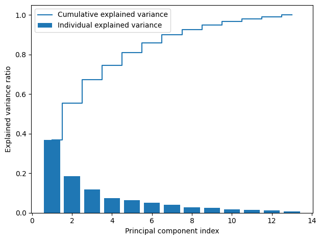
Feature transformation
This code extracts the eigenvalues and eigenvectors from the covariance matrix calculated earlier. Each eigenvector represents a principal component and each eigenvalue represents the magnitude or importance of the corresponding eigenvector.
The eigen_pairs list is created by pairing each eigenvalue with its corresponding eigenvector in a tuple. The np.abs function is used to convert any negative eigenvalues to positive values, since we are interested only in the magnitude of the eigenvalues.
The eigen_pairs list is then sorted in descending order based on the magnitude of the eigenvalues using the sort() function and the key parameter with a lambda function. This sorts the eigenvectors in order of decreasing importance, so that the most important principal components come first.
# Make a list of (eigenvalue, eigenvector) tuples
eigen_pairs = [(np.abs(eigen_vals[i]), eigen_vecs[:, i])
               for i in range(len(eigen_vals))]

# Sort the (eigenvalue, eigenvector) tuples from high to low
eigen_pairs.sort(key=lambda k: k[0], reverse=True)
In this below code block, we’re simply concatenating the two eigenvectors with the highest corresponding eigenvalues into a 2 x d-dimensional transformation matrix W by stacking the two eigenvectors horizontally using the np.hstack() function. The [:, np.newaxis] expression is used to add a new axis to the selected eigenvectors so that we can stack them horizontally. The resulting matrix W will be used to transform our data onto the new subspace.
w = np.hstack((eigen_pairs[0][1][:, np.newaxis],
               eigen_pairs[1][1][:, np.newaxis]))
print('Matrix W:\n', w)
Matrix W:
[[-0.13724218 0.50303478]
[ 0.24724326 0.16487119]
[-0.02545159 0.24456476]
[ 0.20694508 -0.11352904]
[-0.15436582 0.28974518]
[-0.39376952 0.05080104]
[-0.41735106 -0.02287338]
[ 0.30572896 0.09048885]
[-0.30668347 0.00835233]
[ 0.07554066 0.54977581]
[-0.32613263 -0.20716433]
[-0.36861022 -0.24902536]
[-0.29669651 0.38022942]]
Note Depending on which version of NumPy and LAPACK you are using, you may obtain the Matrix W with its signs flipped. Please note that this is not an issue: If is an eigenvector of a matrix , we have
where is our eigenvalue,
then is also an eigenvector that has the same eigenvalue, since
X_train_std[0]array([ 0.71225893, 2.22048673, -0.13025864, 0.05962872, -0.50432733,
-0.52831584, -1.24000033, 0.84118003, -1.05215112, -0.29218864,
-0.20017028, -0.82164144, -0.62946362])X_train_std[0].dot(w)array([2.38299011, 0.45458499])This code is performing the final step of principal component analysis, which is projecting the standardized training data onto the 2-dimensional space defined by the first two principal components.
X_train_std.dot(w) calculates the dot product of the standardized training data with the matrix w which contains the eigenvectors sorted by their eigenvalues. This results in a new matrix X_train_pca with the same number of rows as the original data but only 2 columns.
The subsequent code creates a scatter plot of the projected data with the first principal component (PC 1) on the x-axis and the second principal component (PC 2) on the y-axis. Each class is represented by a different color and marker shape. The legend shows which class each color and shape combination represents.
This plot allows us to visualize how well the first two principal components separate the different classes in the training data.
X_train_pca = X_train_std.dot(w)
colors = ['r', 'b', 'g']
markers = ['o', 's', '^']

for l, c, m in zip(np.unique(y_train), colors, markers):
    plt.scatter(X_train_pca[y_train == l, 0],
                X_train_pca[y_train == l, 1],
                c=c, label=f'Class {l}', marker=m)

plt.xlabel('PC 1')
plt.ylabel('PC 2')
plt.legend(loc='lower left')
plt.tight_layout()
# plt.savefig('figures/05_03.png', dpi=300)
plt.show()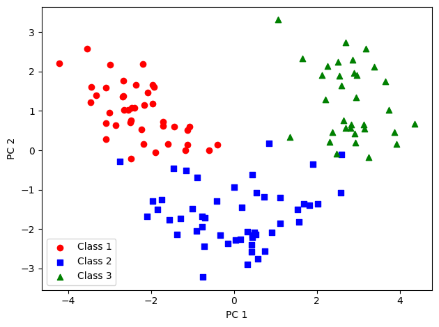
Principal component analysis in scikit-learn
NOTE
The following four code cells have been added in addition to the content to the book, to illustrate how to replicate the results from our own PCA implementation in scikit-learn:
In the given code, we are using Scikit-learn’s PCA class to perform principal component analysis on the standardized training set X_train_std. First, an instance of the PCA class is created and then fit_transform method is called to apply PCA to the training set. Finally, explained_variance_ratio_ attribute is used to obtain the ratio of variance explained by each principal component.
from sklearn.decomposition import PCA

pca = PCA()
X_train_pca = pca.fit_transform(X_train_std)
pca.explained_variance_ratio_
array([0.36951469, 0.18434927, 0.11815159, 0.07334252, 0.06422108,
0.05051724, 0.03954654, 0.02643918, 0.02389319, 0.01629614,
0.01380021, 0.01172226, 0.00820609])pca.explained_variance_ratio_.sum()np.float64(0.9999999999999999)The code is plotting the amount of variance explained by each principal component, as well as the cumulative amount of variance explained by all the principal components up to that point. The plot helps us to decide how many principal components to keep in order to retain most of the information in the dataset.
plt.bar(range(1, 14), pca.explained_variance_ratio_, align='center')
plt.step(range(1, 14), np.cumsum(pca.explained_variance_ratio_), where='mid')
plt.ylabel('Explained variance ratio')
plt.xlabel('Principal components')

plt.show()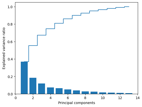
This code performs PCA with 2 principal components, fits and transforms the training data to create X_train_pca, and only transforms the test data to create X_test_pca.
pca = PCA(n_components=2)
X_train_pca = pca.fit_transform(X_train_std)
X_test_pca = pca.transform(X_test_std)
plt.scatter(X_train_pca[:, 0], X_train_pca[:, 1])
plt.xlabel('PC 1')
plt.ylabel('PC 2')
plt.show()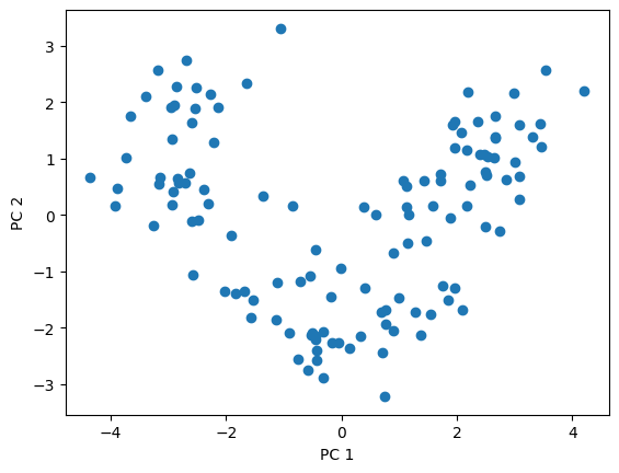
This code defines a function plot_decision_regions which takes input variables X, y, classifier, test_idx, and resolution. The purpose of this function is to plot the decision regions for a 2D dataset that is being classified by a trained classifier.
First, it sets up a color map and marker generator for each class in the dataset. Then, it sets up the limits of the plot based on the minimum and maximum values of each feature in X.
Next, it creates a meshgrid of points with a specified resolution that spans the range of feature values in X. The classifier is then used to predict the class of each point in the meshgrid, and the predicted labels are reshaped to match the meshgrid shape.
Finally, the plot is created with decision regions and class examples. The decision regions are created using plt.contourf() and the class examples are plotted as scatter points.
from matplotlib.colors import ListedColormap

def plot_decision_regions(X, y, classifier, test_idx=None, resolution=0.02):

    # setup marker generator and color map
    markers = ('o', 's', '^', 'v', '<')
    colors = ('red', 'blue', 'lightgreen', 'gray', 'cyan')
    cmap = ListedColormap(colors[:len(np.unique(y))])

    # plot the decision surface
    x1_min, x1_max = X[:, 0].min() - 1, X[:, 0].max() + 1
    x2_min, x2_max = X[:, 1].min() - 1, X[:, 1].max() + 1
    xx1, xx2 = np.meshgrid(np.arange(x1_min, x1_max, resolution),
                           np.arange(x2_min, x2_max, resolution))
    lab = classifier.predict(np.array([xx1.ravel(), xx2.ravel()]).T)
    lab = lab.reshape(xx1.shape)
    plt.contourf(xx1, xx2, lab, alpha=0.3, cmap=cmap)
    plt.xlim(xx1.min(), xx1.max())
    plt.ylim(xx2.min(), xx2.max())

    # plot class examples
    for idx, cl in enumerate(np.unique(y)):
        plt.scatter(x=X[y == cl, 0],
                    y=X[y == cl, 1],
                    alpha=0.8,
                    c=colors[idx],
                    marker=markers[idx],
                    label=f'Class {cl}',
                    edgecolor='black')
Training logistic regression classifier using the first 2 principal components.
Perform PCA on the standardized training and test sets, retaining only the top 2 principal components.
Train a logistic regression classifier on the reduced training set using the OvR (one-vs-rest) approach for multiclass classification.
The
multi_classparameter inLogisticRegressionis set to'ovr'to specify this.The
'lbfgs'solver is used to optimize the logistic regression objective function.
from sklearn.linear_model import LogisticRegression

pca = PCA(n_components=2)
X_train_pca = pca.fit_transform(X_train_std)
X_test_pca = pca.transform(X_test_std)

# `multi_class` was removed from LogisticRegression in modern scikit-learn;
# the solver now picks an appropriate multiclass strategy automatically.
lr = LogisticRegression(random_state=1, solver='lbfgs')
lr = lr.fit(X_train_pca, y_train)
plot_decision_regions(X_train_pca, y_train, classifier=lr)
plt.xlabel('PC 1')
plt.ylabel('PC 2')
plt.legend(loc='lower left')
plt.tight_layout()
# plt.savefig('figures/05_04.png', dpi=300)
plt.show()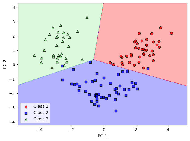
plot_decision_regions(X_test_pca, y_test, classifier=lr)
plt.xlabel('PC 1')
plt.ylabel('PC 2')
plt.legend(loc='lower left')
plt.tight_layout()
# plt.savefig('figures/05_05.png', dpi=300)
plt.show()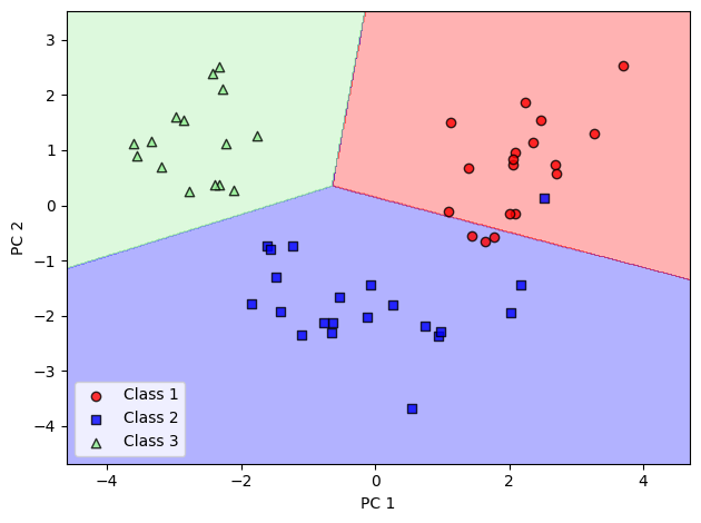
pca = PCA(n_components=None)
X_train_pca = pca.fit_transform(X_train_std)
pca.explained_variance_ratio_
array([0.36951469, 0.18434927, 0.11815159, 0.07334252, 0.06422108,
0.05051724, 0.03954654, 0.02643918, 0.02389319, 0.01629614,
0.01380021, 0.01172226, 0.00820609])Assessing feature contributions
This code calculates the loadings for principal component (PC) 1 and plots them as a bar chart. Loadings are the weights by which each of the original features contribute to the principal component.
The loadings are calculated by multiplying each column of the eigenvector matrix (which contains the coefficients of each feature in the principal components) by the square root of the corresponding eigenvalue.
The resulting loadings are plotted using a bar chart with the feature names on the x-axis and the loadings on the y-axis. The ylim function is used to set the y-axis limits to -1 and 1. The x-axis tick labels are rotated by 90 degrees for better visibility. Finally, the plot is saved as a PNG file and displayed using the show function.
loadings = eigen_vecs * np.sqrt(eigen_vals)

fig, ax = plt.subplots()

ax.bar(range(13), loadings[:, 0], align='center')
ax.set_ylabel('Loadings for PC 1')
ax.set_xticks(range(13))
ax.set_xticklabels(df_wine.columns[1:], rotation=90)

plt.ylim([-1, 1])
plt.tight_layout()
plt.savefig('figures/05_05_02.png', dpi=300)
plt.show()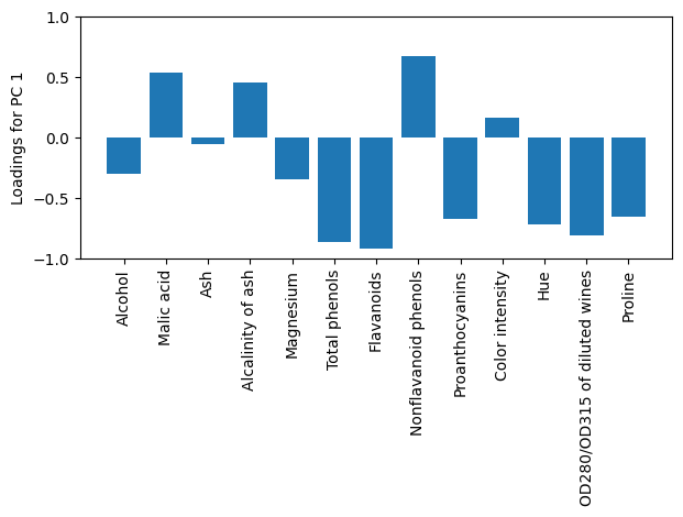
loadings[:, 1]array([ 0.78189545, 0.25626863, 0.38014086, -0.17646463, 0.45036735,
0.07896293, -0.03555339, 0.14065194, 0.01298249, 0.85454768,
-0.32200725, -0.38707422, 0.59101213])This code block compares the loading vectors obtained from PCA using NumPy’s cov function and the sklearn PCA implementation. Here, pca.components_ in sklearn is equivalent to the transpose of the eigenvectors matrix obtained using NumPy’s cov function. np.sqrt(pca.explained_variance_) computes the square root of the eigenvalues, which is equivalent to the standard deviation.
The code then plots the loadings for PC 1 for both implementations using a bar plot. The loadings indicate the weights assigned to each feature (column) in the original dataset to calculate the principal component. Here, each bar shows the weights of the features for PC 1. The x-axis shows the feature names and the y-axis shows the loadings for PC 1, which can range from -1 to 1. The set_xticklabels() function rotates the feature names by 90 degrees to avoid overlapping text. Finally, the plot is saved to a file named ‘figures/05_05_03.png’ and displayed using plt.show().
sklearn_loadings = pca.components_.T * np.sqrt(pca.explained_variance_)

fig, ax = plt.subplots()

ax.bar(range(13), sklearn_loadings[:, 0], align='center')
ax.set_ylabel('Loadings for PC 1')
ax.set_xticks(range(13))
ax.set_xticklabels(df_wine.columns[1:], rotation=90)

plt.ylim([-1, 1])
plt.tight_layout()
plt.savefig('figures/05_05_03.png', dpi=300)
plt.show()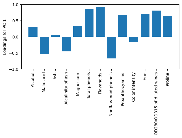
Supervised data compression via linear discriminant analysis
Principal component analysis versus linear discriminant analysis
Image(url=f'{FIGURES_BASE_URL}/05_06.png', width=400)
The inner workings of linear discriminant analysis
Computing the scatter matrices
Calculate the mean vectors for each class:
The for loop iterates over the class labels, which range from 1 to 3. For each class, it uses boolean indexing to extract the rows of the standardized training dataset X_train_std that correspond to the current class label. It then computes the mean of these rows along each column (feature) axis by specifying axis=0. The resulting mean vector is appended to the mean_vecs list.
np.set_printoptions(precision=4)

mean_vecs = []
for label in range(1, 4):
    mean_vecs.append(np.mean(X_train_std[y_train == label], axis=0))
    print(f'MV {label}: {mean_vecs[label - 1]}\n')
MV 1: [ 0.9066 -0.3497 0.3201 -0.7189 0.5056 0.8807 0.9589 -0.5516 0.5416
0.2338 0.5897 0.6563 1.2075]
MV 2: [-0.8749 -0.2848 -0.3735 0.3157 -0.3848 -0.0433 0.0635 -0.0946 0.0703
-0.8286 0.3144 0.3608 -0.7253]
MV 3: [ 0.1992 0.866 0.1682 0.4148 -0.0451 -1.0286 -1.2876 0.8287 -0.7795
0.9649 -1.209 -1.3622 -0.4013]
Compute the within-class scatter matrix:
In this code, we first initialize a d x d matrix of zeros, where d is the number of features in our dataset. We then iterate over each label (1 to 3), and for each label, we compute a scatter matrix, which is also a d x d matrix. The scatter matrix for a given label is computed by taking the difference between each feature vector in that label’s class and the mean feature vector of that class, and then multiplying this difference by its transpose. We sum these scatter matrices over all classes to get the within-class scatter matrix S_W, which is also a d x d matrix. The S_W matrix provides a measure of how the data is scattered within each class.
d = 13 # number of features
S_W = np.zeros((d, d))
for label, mv in zip(range(1, 4), mean_vecs):
    class_scatter = np.zeros((d, d))  # scatter matrix for each class
    for row in X_train_std[y_train == label]:
        row, mv = row.reshape(d, 1), mv.reshape(d, 1)  # make column vectors
        class_scatter += (row - mv).dot((row - mv).T)
    S_W += class_scatter                          # sum class scatter matrices

print('Within-class scatter matrix: '
      f'{S_W.shape[0]}x{S_W.shape[1]}')
Within-class scatter matrix: 13x13
Better: covariance matrix since classes are not equally distributed:
This code uses NumPy’s bincount function to count the number of occurrences of each class label in the y_train array. The function returns a list where each element represents the count of each class label.
print('Class label distribution:',
      np.bincount(y_train)[1:])
Class label distribution: [41 50 33]
This code block calculates the scaled within-class scatter matrix S_W using the training data. It starts by initializing an empty matrix S_W of size d-by-d, where d is the number of features in the dataset. Then, it iterates over each class label and computes the scatter matrix for that class, which measures the variance of the data in that class. The scatter matrix for a particular class is computed as the covariance matrix of the standardized features for that class, which is equivalent to the scatter matrix computed in the previous code block.
Once the scatter matrix for each class has been computed, they are summed together to obtain the total within-class scatter matrix S_W. This matrix measures the total variance of the data within each class, taking into account the different sample sizes of each class.
The resulting matrix S_W is a d-by-d matrix, where the (i,j)-th element measures the covariance between the i-th and j-th features across all classes.
d = 13  # number of features
S_W = np.zeros((d, d))
for label, mv in zip(range(1, 4), mean_vecs):
    class_scatter = np.cov(X_train_std[y_train == label].T)
    S_W += class_scatter

print('Scaled within-class scatter matrix: '
      f'{S_W.shape[0]}x{S_W.shape[1]}')
Scaled within-class scatter matrix: 13x13
Compute the between-class scatter matrix:
mean_overall = np.mean(X_train_std, axis=0)
mean_overall = mean_overall.reshape(d, 1)  # make column vector

d = 13  # number of features
S_B = np.zeros((d, d))

for i, mean_vec in enumerate(mean_vecs):
    n = X_train_std[y_train == i + 1, :].shape[0]
    mean_vec = mean_vec.reshape(d, 1)  # make column vector
    S_B += n * (mean_vec - mean_overall).dot((mean_vec - mean_overall).T)

print('Between-class scatter matrix: '
      f'{S_B.shape[0]}x{S_B.shape[1]}')
Between-class scatter matrix: 13x13
Selecting linear discriminants for the new feature subspace
Solve the generalized eigenvalue problem for the matrix :
This code computes the eigenvalues and eigenvectors of the matrix product of the inverse of the within-class scatter matrix (S_W) and the between-class scatter matrix (S_B) using NumPy’s linalg.eig function. The eigenvalues and eigenvectors represent the linear discriminants, which are the directions in the feature space that maximize the class separability. The eigenvectors are also referred to as loadings, which represent the weight or contribution of each feature to the discriminative power of the linear discriminant. The eigenvalues represent the variance or amount of information preserved in the new feature subspace. The higher the eigenvalue, the more important the corresponding linear discriminant is in explaining the class separability.
eigen_vals, eigen_vecs = np.linalg.eig(np.linalg.inv(S_W).dot(S_B))Note:
Above, I used the numpy.linalg.eig function to decompose the symmetric covariance matrix into its eigenvalues and eigenvectors.
>>> eigen_vals, eigen_vecs = np.linalg.eig(cov_mat)numpy.linalg.eigh in such cases, which has been designed for Hermetian matrices. The latter always returns real eigenvalues; whereas the numerically less stable np.linalg.eig can decompose nonsymmetric square matrices, you may find that it returns complex eigenvalues in certain cases. (S.R.)Sort eigenvectors in descending order of the eigenvalues:
The first line creates a list of tuples, where each tuple contains the absolute value of an eigenvalue and the corresponding eigenvector.
The second line sorts the list of tuples by eigenvalue, in descending order. The key argument specifies that the sorting should be based on the first element of each tuple (i.e., the eigenvalue).
The third line prints out the sorted list of eigenvalues, in descending order.
# Make a list of (eigenvalue, eigenvector) tuples
eigen_pairs = [(np.abs(eigen_vals[i]), eigen_vecs[:, i])
               for i in range(len(eigen_vals))]

# Sort the (eigenvalue, eigenvector) tuples from high to low
eigen_pairs = sorted(eigen_pairs, key=lambda k: k[0], reverse=True)

# Visually confirm that the list is correctly sorted by decreasing eigenvalues

print('Eigenvalues in descending order:\n')
for eigen_val in eigen_pairs:
    print(eigen_val[0])
Eigenvalues in descending order:
349.61780890599397
172.7615221897938
3.277875948160424e-14
2.842170943040401e-14
2.6347620763320822e-14
2.6347620763320822e-14
1.7169492680170306e-14
1.7169492680170306e-14
1.674335053365992e-14
1.2740060380615543e-14
7.458378098449665e-15
4.737048557054326e-15
3.688843187314971e-15
Notcie in LDA the number of linear discriminants is at most c-1
This code is creating a bar plot that shows the individual and cumulative discriminability ratios for each linear discriminant. It first computes the total sum of eigenvalues, which represents the total variance, and then calculates the discriminability ratio for each linear discriminant by dividing its eigenvalue by the total sum of eigenvalues.
The discriminability ratios are then sorted in descending order, and the cumulative discriminability ratios are computed using the np.cumsum() function. Finally, the bar plot is created using plt.bar() and plt.step() functions from Matplotlib. The x-axis represents the linear discriminants, and the y-axis represents the discriminability ratio. The legend shows the labels for the individual and cumulative discriminability ratios.
tot = sum(eigen_vals.real)
discr = [(i / tot) for i in sorted(eigen_vals.real, reverse=True)]
cum_discr = np.cumsum(discr)

plt.bar(range(1, 14), discr, align='center',
        label='Individual discriminability')
plt.step(range(1, 14), cum_discr, where='mid',
         label='Cumulative discriminability')
plt.ylabel('Discriminability ratio')
plt.xlabel('Linear discriminants')
plt.ylim([-0.1, 1.1])
plt.legend(loc='best')
plt.tight_layout()
#plt.savefig('figures/05_07.png', dpi=300)
plt.show()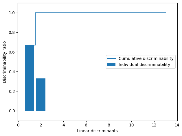
np.hstack() is used to horizontally stack the two eigenvectors with the largest corresponding eigenvalues into a matrix w:
w = np.hstack((eigen_pairs[0][1][:, np.newaxis].real,
              eigen_pairs[1][1][:, np.newaxis].real))
print('Matrix W:\n', w)
Matrix W:
[[-0.1481 -0.4092]
[ 0.0908 -0.1577]
[-0.0168 -0.3537]
[ 0.1484 0.3223]
[-0.0163 -0.0817]
[ 0.1913 0.0842]
[-0.7338 0.2823]
[-0.075 -0.0102]
[ 0.0018 0.0907]
[ 0.294 -0.2152]
[-0.0328 0.2747]
[-0.3547 -0.0124]
[-0.3915 -0.5958]]
Projecting examples onto the new feature space
This code projects the standardized training dataset X_train_std onto the new feature space defined by the linear discriminants w obtained from LDA. Then, it creates a scatter plot of the data points in the two-dimensional LDA subspace, where each class is represented by a different marker color and shape.
Specifically, X_train_lda is the projection of the standardized training dataset onto the LDA subspace, which is computed by taking the dot product of X_train_std and w. The loop over np.unique(y_train) creates a scatter plot for each class separately. The x-axis corresponds to the first linear discriminant (LD 1) and the y-axis corresponds to the second linear discriminant (LD 2). The (-1) term in the y coordinates is used to invert the direction of the y-axis so that the plot matches the convention of having higher values at the top of the plot. Finally, the legend and axis labels are added, and the plot is saved and displayed.
X_train_lda = X_train_std.dot(w)
colors = ['r', 'b', 'g']
markers = ['o', 's', '^']

for l, c, m in zip(np.unique(y_train), colors, markers):
    plt.scatter(X_train_lda[y_train == l, 0],
                X_train_lda[y_train == l, 1] * (-1),
                c=c, label=f'Class {l}', marker=m)

plt.xlabel('LD 1')
plt.ylabel('LD 2')
plt.legend(loc='lower right')
plt.tight_layout()
plt.savefig('figures/05_08.png', dpi=300)
plt.show()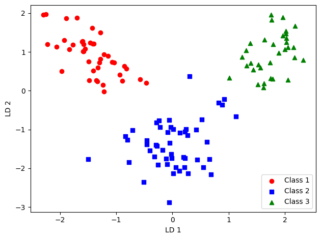
LDA via scikit-learn
First, we create an instance of the LDA class with n_components=2, which specifies that we want to reduce the dimensionality of our feature space to two dimensions.
Next, we call the fit_transform() method of the LDA instance on our training set X_train_std and corresponding labels y_train. This method performs LDA on the training data and returns the transformed training set X_train_lda with reduced dimensionality.
We can then use X_train_lda for training a classifier, or for visualization purposes to plot the training data in the new, lower-dimensional feature space.
from sklearn.discriminant_analysis import LinearDiscriminantAnalysis as LDA

lda = LDA(n_components=2)
X_train_lda = lda.fit_transform(X_train_std, y_train)
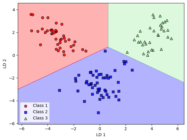
This code performs linear discriminant analysis (LDA) on the wine dataset, applies logistic regression on the transformed data, and plots the decision regions for the resulting classifier. The plot shows the separation of the three wine classes in the two-dimensional subspace defined by the first two linear discriminants.
from sklearn.linear_model import LogisticRegression

lr = LogisticRegression(random_state=1, solver='lbfgs')
lr = lr.fit(X_train_lda, y_train)

plot_decision_regions(X_train_lda, y_train, classifier=lr)
plt.xlabel('LD 1')
plt.ylabel('LD 2')
plt.legend(loc='lower left')
plt.tight_layout()
# plt.savefig('figures/05_09.png', dpi=300)
plt.show()
X_test_lda = lda.transform(X_test_std)

plot_decision_regions(X_test_lda, y_test, classifier=lr)
plt.xlabel('LD 1')
plt.ylabel('LD 2')
plt.legend(loc='lower left')
plt.tight_layout()
# plt.savefig('figures/05_10.png', dpi=300)
plt.show()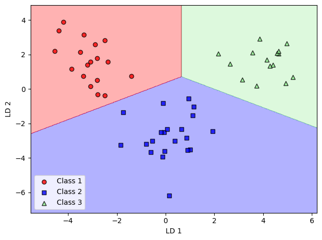
Nonlinear dimensionality reduction techniques
Image(url=f'{FIGURES_BASE_URL}/05_11.png', width=500)
Visualizing data via t-distributed stochastic neighbor embedding
This code loads the load_digits() dataset from the sklearn.datasets module, which contains images of handwritten digits. It then creates a figure with four subplots using plt.subplots(), where each subplot shows one of the first four images in the dataset using imshow() with the Greys colormap.
import matplotlib.pyplot as plt

from sklearn.datasets import load_digits

digits = load_digits()

fig, ax = plt.subplots(1, 4)

for i in range(4):
    ax[i].imshow(digits.images[i], cmap='Greys')

# plt.savefig('figures/05_12.png', dpi=300)
plt.show()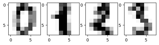
After loading the digits dataset in the previous code block, digits.data returns a 2D numpy array where each row represents one image in the dataset and each column represents a feature (i.e., pixel) of that image. The shape of this array is (1797, 64), indicating that there are 1797 images in the dataset and each image has 64 features (i.e., an 8x8 grid of pixels).
digits.data.shape(1797, 64)These two lines of code create two variables y_digits and X_digits that contain the target labels and feature data, respectively, for the digits dataset.
digits.target is a 1D numpy array that contains the target labels for each image in the dataset. The length of this array is the same as the number of rows in digits.data, i.e., 1797. Each element in the array corresponds to the digit that the corresponding image represents, with values ranging from 0 to 9.
digits.data is a 2D numpy array that contains the feature data for each image in the dataset. As mentioned in the previous code block, each row in this array represents an image and each column represents a pixel in that image. The shape of this array is (1797, 64), indicating that there are 1797 images and 64 features.
By setting y_digits = digits.target and X_digits = digits.data, the code is simply assigning the target labels and feature data to these variables for later use.
y_digits = digits.target
X_digits = digits.data
This code imports the TSNE class from the sklearn.manifold module, which provides an implementation of the t-distributed stochastic neighbor embedding (t-SNE) algorithm for dimensionality reduction and visualization.
The TSNE class is then instantiated with the following arguments:
n_components=2: Specifies the number of dimensions to reduce the feature data to. In this case, n_components is set to 2, meaning that the algorithm will reduce the 64-dimensional feature data for each image in the digits dataset to a 2-dimensional representation.init='pca': Specifies the initialization method for the optimization algorithm used by t-SNE. In this case, the ‘pca’ option specifies that the principal component analysis (PCA) method will be used to initialize the optimization.random_state=123: Sets the random seed for the algorithm to ensure reproducibility of the results.
The fit_transform() method is then called on the TSNE object with the X_digits dataset as input. This method applies the t-SNE algorithm to the feature data to reduce its dimensionality to 2 dimensions and returns the transformed data in a new variable X_digits_tsne, which is a 2D numpy array with shape (1797, 2).
Therefore, X_digits_tsne now contains a 2-dimensional representation of the feature data for each image in the digits dataset, which can be used for visualization purposes.
from sklearn.manifold import TSNE


tsne = TSNE(n_components=2,
            init='pca',
            random_state=123)
X_digits_tsne = tsne.fit_transform(X_digits)
This code defines a Python function called plot_projection() that takes in two arguments:
x: a 2D numpy array of shape(n_samples, 2)that represents the projected data to be plotted. In this case,xcorresponds toX_digits_tsne.colors: a 1D numpy array of shape(n_samples,)that contains the labels for each sample inx. In this case,colorscorresponds toy_digits.
The function then creates a new figure with plt.figure() and an Axes object with plt.subplot(). The aspect ratio of the Axes object is set to equal to ensure that the aspect ratio of the plot is preserved.
The function then creates a scatter plot of the projected data x using plt.scatter(). The colors argument is used to set the color of each point based on its label.
Next, the function iterates through each label and adds a text label to the plot using ax.text(). The text label is positioned at the median of the projected data points with the corresponding label, and the label itself is set to the corresponding digit using str(i). The text label is styled with a white stroke using PathEffects.Stroke() and a normal style using PathEffects.Normal().
Finally, the function calls plot_projection(X_digits_tsne, y_digits) to generate the plot using the projected data X_digits_tsne and its corresponding labels y_digits.
import numpy as np
import matplotlib.patheffects as PathEffects


def plot_projection(x, colors):

    f = plt.figure(figsize=(8, 8))
    ax = plt.subplot(aspect='equal')
    for i in range(10):
        plt.scatter(x[colors == i, 0],
                    x[colors == i, 1])

    for i in range(10):

        xtext, ytext = np.median(x[colors == i, :], axis=0)
        txt = ax.text(xtext, ytext, str(i), fontsize=24)
        txt.set_path_effects([
            PathEffects.Stroke(linewidth=5, foreground="w"),
            PathEffects.Normal()])

plot_projection(X_digits_tsne, y_digits)
# plt.savefig('figures/05_13.png', dpi=300)
plt.show()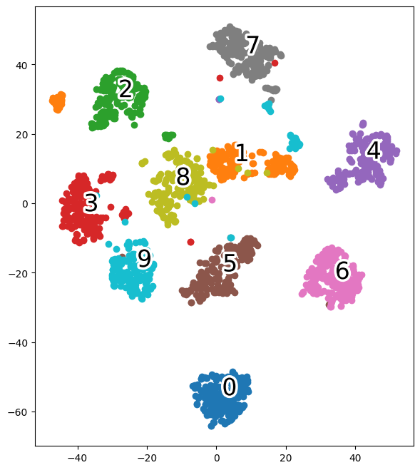
Summary
...
Readers may ignore the next cell.
# This cell converts the notebook to a plain .py script using a helper script
# from the book's companion repo. It isn't needed to run the notebook itself,
# and the helper script isn't present on Colab, so it's skipped here.
# ! python ../.convert_notebook_to_script.py --input ch05.ipynb --output ch05.py