

A Tour of Machine Learning Classifiers Using Scikit-Learn
Package version checks
Add folder to path in order to load from the check_packages.py script:
import sys
sys.path.insert(0, '..')
Check recommended package versions:
# Package version check (Colab-safe: no external script required)
import importlib

def check_packages(d):
    for pkg_name, min_version in d.items():
        try:
            imported = importlib.import_module(pkg_name)
            version = getattr(imported, '__version__', 'unknown')
            print(f'[OK] {pkg_name} {version}')
        except ImportError:
            print(f'[MISSING] {pkg_name} is not installed')

d = {
    'numpy': '1.21.2',
    'matplotlib': '3.4.3',
    'sklearn': '1.0',
    'pandas': '1.3.2'
}
check_packages(d)
[OK] numpy 2.0.2
[OK] matplotlib 3.10.0
[OK] sklearn 1.6.1
[OK] pandas 2.2.2
Chapter 3 - A Tour of Machine Learning Classifiers Using Scikit-Learn
Overview
from IPython.display import Image
%matplotlib inline
Choosing a classification algorithm
...
First steps with scikit-learn
Loading the Iris dataset from scikit-learn
The Iris dataset is a well-known dataset in the field of machine learning, and scikit-learn provides an easy way to load it.
Here, we’re loading the dataset and assigning the features (petal length and petal width) to the variable X, and the target (the type of Iris plant) to the variable y.
We’re also printing out the unique class labels for the target variable to confirm that they are as expected:
0: Iris-Setosa
1: Iris-Versicolor
2: Iris-Virginica
Loading the Iris dataset from scikit-learn. Here, the third column represents the petal length, and the fourth column the petal width of the flower examples. The classes are already converted to integer labels where 0=Iris-Setosa, 1=Iris-Versicolor, 2=Iris-Virginica.
from sklearn import datasets
import numpy as np

iris = datasets.load_iris()
X = iris.data[:, [2, 3]]
y = iris.target

print('Class labels:', np.unique(y))
Class labels: [0 1 2]
The code below uses the train_test_split() function from scikit-learn’s model_selection module to split the Iris dataset into a training set (70% of the data) and a test set (30% of the data).
The first four input parameters X, y, test_size, and random_state are required. They are the feature matrix, the label vector, the size of the test set, and the seed for the random number generator, respectively.
The stratify parameter is used to ensure that the class labels are distributed in the same way across both the training and test sets. In this case, it is set to the label vector y to ensure that the class distribution in the test and training sets is the same as in the original dataset.
Splitting data into 70% training and 30% test data:
from sklearn.model_selection import train_test_split

X_train, X_test, y_train, y_test = train_test_split(
    X, y, test_size=0.3, random_state=1, stratify=y)
The np.bincount function returns the number of occurrences of each value in an array of non-negative integers. By passing in the y and y_train and y_test variables, we are able to see the number of samples that belong to each class in the original dataset and in the training and test sets, respectively. This is useful to check whether the train-test split preserves the class distribution from the original dataset or not.
print('Labels counts in y:', np.bincount(y))
print('Labels counts in y_train:', np.bincount(y_train))
print('Labels counts in y_test:', np.bincount(y_test))
Labels counts in y: [50 50 50]
Labels counts in y_train: [35 35 35]
Labels counts in y_test: [15 15 15]
This code snippet is using the StandardScaler class from the sklearn.preprocessing module to standardize the training and test feature sets, X_train and X_test.
First, we create an object of the
StandardScalerclass, which will be used to standardize the features.Next, we use the
fitmethod to compute the mean and standard deviation ofX_trainand store it in thescobject.The
transformmethod is then used to standardize the training and test data using the mean and standard deviation that was computed from the training data.The result is stored in new variables
X_train_stdandX_test_stdrespectively, which contain the standardized feature sets.
Standardization is a common preprocessing step in machine learning and is used to scale the features so that they have zero mean and unit variance. This is important as many machine learning algorithms perform better or converge faster when the features are on a similar scale.
Standardizing the features:
from sklearn.preprocessing import StandardScaler

sc = StandardScaler()
sc.fit(X_train)
X_train_std = sc.transform(X_train)
X_test_std = sc.transform(X_test)
Training a perceptron via scikit-learn
This code snippet is using the Perceptron class from the sklearn.linear_model module to train a perceptron model on the standardized training data, X_train_std and y_train.
First, we create an object of the Perceptron class, which will be used to train the perceptron model. The eta0 parameter is set to 0.1 which is the learning rate of the algorithm. And random_state is set to 1, which means the starting point of the random number generator is fixed, so that the results are reproducible.
Next, we use the fit method to train the perceptron model on the standardized training data. The fit method learns the weights of the model that minimize the classification error on the training set.
Once the fit method completes, the trained perceptron model can be used to make predictions on new samples.
from sklearn.linear_model import Perceptron

ppn = Perceptron(eta0=0.1, random_state=1)
ppn.fit(X_train_std, y_train)This code snippet uses the predict method of the Perceptron class to predict the class labels of the samples in the standardized test dataset, X_test_std. The predicted class labels are stored in the variable y_pred.
The next line calculates the number of misclassifications by summing up the number of instances where the true class label, y_test, is not equal to the predicted class label, y_pred. The result is printed to the console.
This gives us an idea of the performance of the model on unseen data, which is important for evaluating the model’s generalization performance.
y_pred = ppn.predict(X_test_std)
print('Misclassified examples: %d' % (y_test != y_pred).sum())
Misclassified examples: 1
This code snippet is using the predict method from the Perceptron class to predict the class labels of the test set, X_test_std, and store the predictions in the variable y_pred. Then it is calculating the number of misclassifications by comparing the predicted class labels, y_pred, with the true class labels, y_test, using the not equal operator (!=) and taking the sum of the resulting Boolean array using the sum method.
Additionally, it is using the accuracy_score function from the sklearn.metrics module to compute the classification accuracy and prints it using the string formatting operator %. The accuracy score is the ratio of correctly predicted samples to the total number of test samples.
from sklearn.metrics import accuracy_score

print('Accuracy: %.3f' % accuracy_score(y_test, y_pred))
Accuracy: 0.978
This code snippet is using the score method of the Perceptron class to evaluate the classification accuracy of the model on the standardized test feature set and true labels.
The score method returns the mean accuracy on the given test data and labels. In this case, the test data is X_test_std and the true labels are y_test. The mean accuracy is then printed using the print function and formatted to show 3 decimal places using the %.3f format specifier.
print('Accuracy: %.3f' % ppn.score(X_test_std, y_test))Accuracy: 0.978
This function creates a plot of decision regions for a given classifier, with the option to highlight a test set of data. This function uses the matplotlib library to create the plot and customize its appearance, including setting the color map, markers, and labels. The function takes four parameters:
Xwhich is the feature setythe target variableclassifierthe classifier to be plottedtest_idxindices of examples in the test set, which would be highlighted in the plotresolutionthe granularity of the grid for plotting the decision regions
It creates a scatter plot of the training set, with different markers and colors for each class. And also it creates a contourf plot of the decision regions of the classifier and if test_idx is provided it’ll also highlight the test set examples.
from matplotlib.colors import ListedColormap
import matplotlib.pyplot as plt

def plot_decision_regions(X, y, classifier, test_idx=None, resolution=0.02):

    # setup marker generator and color map
    markers = ('o', 's', '^', 'v', '<')
    colors = ('red', 'blue', 'lightgreen', 'gray', 'cyan')
    cmap = ListedColormap(colors[:len(np.unique(y))])

    # plot the decision surface
    x1_min, x1_max = X[:, 0].min() - 1, X[:, 0].max() + 1
    x2_min, x2_max = X[:, 1].min() - 1, X[:, 1].max() + 1
    xx1, xx2 = np.meshgrid(np.arange(x1_min, x1_max, resolution),
                           np.arange(x2_min, x2_max, resolution))
    lab = classifier.predict(np.array([xx1.ravel(), xx2.ravel()]).T)
    lab = lab.reshape(xx1.shape)
    plt.contourf(xx1, xx2, lab, alpha=0.3, cmap=cmap)
    plt.xlim(xx1.min(), xx1.max())
    plt.ylim(xx2.min(), xx2.max())

    # plot class examples
    for idx, cl in enumerate(np.unique(y)):
        plt.scatter(x=X[y == cl, 0],
                    y=X[y == cl, 1],
                    alpha=0.8,
                    c=colors[idx],
                    marker=markers[idx],
                    label=f'Class {cl}',
                    edgecolor='black')

    # highlight test examples
    if test_idx:
        # plot all examples
        X_test, y_test = X[test_idx, :], y[test_idx]

        plt.scatter(X_test[:, 0],
                    X_test[:, 1],
                    c='none',
                    edgecolor='black',
                    alpha=1.0,
                    linewidth=1,
                    marker='o',
                    s=100,
                    label='Test set')
Training a perceptron model using the standardized training data:
This code is creating a plot of the decision regions for the perceptron model that has been trained on the standardized training data. It first creates a combined set of the standardized training and test data (X_combined_std) and the corresponding class labels (y_combined) by stacking the training and test data vertically and horizontally, respectively. Then it calls the plot_decision_regions function that we saw earlier, passing it the combined data, the trained perceptron model, and the indices of the test examples.
The plot_decision_regions function is then used to create a 2D scatter plot of the training and test examples, where the decision regions of the perceptron model are color-coded. The decision regions are created by training the perceptron model on a dense grid of points that covers the feature space of the data and then coloring each grid point according to the class label predicted by the model.
The plt.xlabel, plt.ylabel, plt.legend and plt.tight_layout() are used to add axis labels and a legend to the plot, and adjust the layout of the plot so that it fits nicely within the boundaries of the plotting area.
The last line plt.show() is used to display the plot on the screen.
X_combined_std = np.vstack((X_train_std, X_test_std))
y_combined = np.hstack((y_train, y_test))

plot_decision_regions(X=X_combined_std, y=y_combined,
                      classifier=ppn, test_idx=range(105, 150))
plt.xlabel('Petal length [standardized]')
plt.ylabel('Petal width [standardized]')
plt.legend(loc='upper left')

plt.tight_layout()
#plt.savefig('figures/03_01.png', dpi=300)
plt.show()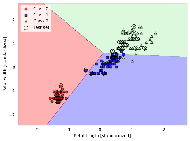
Modeling class probabilities via logistic regression
...
Logistic regression intuition and conditional probabilities
This code is plotting the sigmoid function which is commonly used as an activation function in logistic regression and other neural network models.
The sigmoid function is defined as where is the input. The function maps any input value to a value between 0 and 1. It is often used as the output of a model to represent the probability of a certain class.
Here, the code first imports the necessary libraries, numpy and matplotlib, for numerical computations and plotting, respectively. Then it defines a function sigmoid(z) which takes in input z and returns the value of the sigmoid function evaluated at that point.
The code then creates an array z of values ranging from -7 to 7 with a step of 0.1 using the np.arange() function. It then applies the sigmoid function to each value in the array z and assigns the result to the variable sigma_z.
The code then plots the values of z against sigma_z using the plt.plot() function. It also adds a vertical line at the value of 0 on the x-axis using the plt.axvline() function. It then sets the limits for the y-axis to be between -0.1 and 1.1 using the plt.ylim() function. The x-axis and y-axis are labeled ‘z’ and ‘’ respectively using plt.xlabel() and plt.ylabel().
It then sets the y-axis ticks to be at the values 0.0, 0.5, 1.0 using plt.yticks(). Finally, it shows the gridlines on the y-axis using ax.yaxis.grid(True) and tight the layout with plt.tight_layout()
The last line of the code with plt.show() is used to display the plot. The commented out line is used to save the plot as an image file.
import matplotlib.pyplot as plt
import numpy as np


def sigmoid(z):
    return 1.0 / (1.0 + np.exp(-z))

z = np.arange(-7, 7, 0.1)
sigma_z = sigmoid(z)

plt.plot(z, sigma_z)
plt.axvline(0.0, color='k')
plt.ylim(-0.1, 1.1)
plt.xlabel('z')
plt.ylabel(r'$\sigma (z)$')

# y axis ticks and gridline
plt.yticks([0.0, 0.5, 1.0])
ax = plt.gca()
ax.yaxis.grid(True)

plt.tight_layout()
#plt.savefig('figures/03_02.png', dpi=300)
plt.show()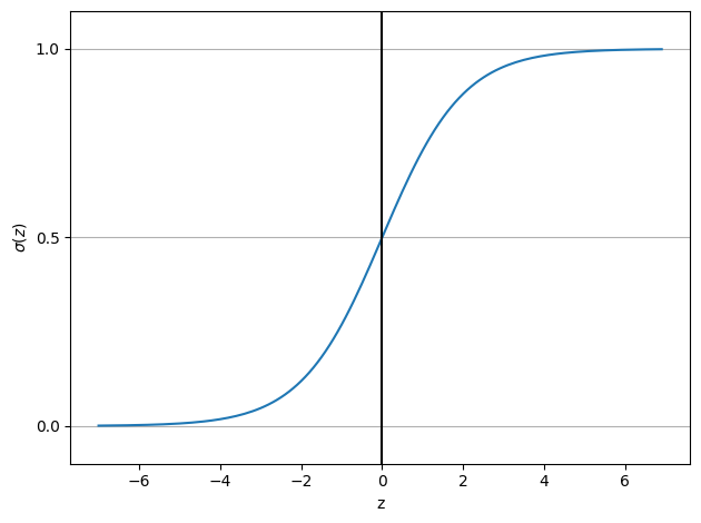
import os, urllib.request
os.makedirs('figures', exist_ok=True)
fig_path = 'figures/03_03.png'
if not os.path.exists(fig_path):
    url = 'https://raw.githubusercontent.com/rasbt/machine-learning-book/main/ch03/figures/03_03.png'
    try:
        urllib.request.urlretrieve(url, fig_path)
    except Exception as e:
        print(f'Could not download figure: {e}')
if os.path.exists(fig_path):
    display(Image(filename=fig_path, width=500))
import os, urllib.request
os.makedirs('figures', exist_ok=True)
fig_path = 'figures/03_25.png'
if not os.path.exists(fig_path):
    url = 'https://raw.githubusercontent.com/rasbt/machine-learning-book/main/ch03/figures/03_25.png'
    try:
        urllib.request.urlretrieve(url, fig_path)
    except Exception as e:
        print(f'Could not download figure: {e}')
if os.path.exists(fig_path):
    display(Image(filename=fig_path, width=500))
Learning the weights of the logistic loss function
This code is creating a plot that illustrates the log-loss function for logistic regression. The log-loss function is used to measure the performance of the logistic regression model. It is a measure of how well the predicted probability estimates for a set of samples compare to the true class labels.
The code first defines two functions, loss_1 and loss_0, which calculate the log-loss for the cases when the true class label is 1 and 0, respectively. These functions make use of the sigmoid function, which is defined earlier in the code and takes an input z and returns the sigmoid of z.
The variable z is created using the numpy function arange which creates a range of values from -10 to 10 in increments of 0.1. The variable sigma_z is then created by passing z through the sigmoid function.
Then the code creates two lists, c1 and c0, by applying the loss_1 and loss_0 functions to each value in z respectively.
Then the code creates a plot with two lines, one for c1 and one for c0. The c1 line shows the log-loss for the case when the true class label is 1, and the c0 line shows the log-loss for the case when the true class label is 0. The line for c1 is plotted as solid line and the line for c0 is plotted as dashed line.
The code then sets the y-axis limit from 0.0 to 5.1 and the x-axis limit from 0 to 1. Then it sets x-axis label as ‘’ and y-axis label as ‘L(w, b)’. Then it adds a legend to the plot, locates it at the best position and tightens the layout.
Finally, it shows the plot.
def loss_1(z):
    return - np.log(sigmoid(z))


def loss_0(z):
    return - np.log(1 - sigmoid(z))

z = np.arange(-10, 10, 0.1)
sigma_z = sigmoid(z)

c1 = [loss_1(x) for x in z]
plt.plot(sigma_z, c1, label='L(w, b) if y=1')

c0 = [loss_0(x) for x in z]
plt.plot(sigma_z, c0, linestyle='--', label='L(w, b) if y=0')

plt.ylim(0.0, 5.1)
plt.xlim([0, 1])
plt.xlabel(r'$\sigma(z)$')
plt.ylabel('L(w, b)')
plt.legend(loc='best')
plt.tight_layout()
#plt.savefig('figures/03_04.png', dpi=300)
plt.show()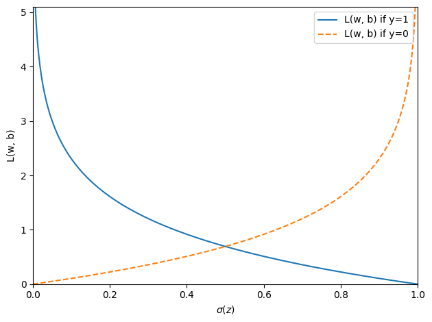
The LogisticRegressionGD class is an implementation of logistic regression using gradient descent. Logistic regression is a supervised learning algorithm that is used for classification problems. It is a linear model that is used to estimate the probability of a binary outcome (e.g. 0 or 1, True or False) based on one or more input features.
The class has three parameters: eta, n_iter, and random_state. eta is the learning rate, which controls the step size at which the algorithm makes updates to the model weights. n_iter is the number of passes over the training dataset, also known as epochs. random_state is a seed for the random number generator used to initialize the model weights.
The class has several methods:
__init__(self, eta=0.01, n_iter=50, random_state=1): This is the constructor for the class, which sets the initial values for the parameters and initializes the attributesw_,b_, andlosses_.w_will store the model weights,b_will store the bias term, andlosses_will store the loss function values in each epoch.fit(self, X, y): This method takes as input the training data (X) and the target values (y) and fits the model to the data. The method first initializes the model weights and bias term using a random number generator. Then, it performs the gradient descent algorithm for the number of iterations specified by n_iter. In each iteration, the method calculates the net input, the output of the model, the errors, the gradient of the loss function with respect to the weights and bias, and updates the weights and bias. Finally, it records the loss function value for that iteration.net_input(self, X): This method calculates the net input to the model by taking the dot product of the input data (X) and the model weights (self.w_), and adding the bias term (self.b_).activation(self, z): This method calculates the sigmoid activation function of the net input. The sigmoid function maps any input value to a value between 0 and 1, and is often used as the activation function in logistic regression.predict(self, X): This method takes as input new data (X) and returns the predicted class labels. It does this by calculating the model’s output using the sigmoid activation function and returning 1 if the output is greater than or equal to 0.5, and 0 otherwise.
In summary, this class is an implementation of logistic regression algorithm using gradient descent optimization. It starts by initializing the weights, bias and losses list, then in each iteration, it uses the net_input, activation and errors to calculate the gradient of the loss function with respect to the weights and bias and updates them. It also records the loss function value for that iteration. Finally, the predict method use the learned model to predict the class label of new input data based on the learned weights and bias
class LogisticRegressionGD:
    """Gradient descent-based logistic regression classifier.

    Parameters
    ------------
    eta : float
      Learning rate (between 0.0 and 1.0)
    n_iter : int
      Passes over the training dataset.
    random_state : int
      Random number generator seed for random weight
      initialization.


    Attributes
    -----------
    w_ : 1d-array
      Weights after training.
    b_ : Scalar
      Bias unit after fitting.
    losses_ : list
      Mean squared error loss function values in each epoch.

    """
    def __init__(self, eta=0.01, n_iter=50, random_state=1):
        self.eta = eta
        self.n_iter = n_iter
        self.random_state = random_state

    def fit(self, X, y):
        """ Fit training data.

        Parameters
        ----------
        X : {array-like}, shape = [n_examples, n_features]
          Training vectors, where n_examples is the number of examples and
          n_features is the number of features.
        y : array-like, shape = [n_examples]
          Target values.

        Returns
        -------
        self : Instance of LogisticRegressionGD

        """
        rgen = np.random.RandomState(self.random_state)
        self.w_ = rgen.normal(loc=0.0, scale=0.01, size=X.shape[1])
        self.b_ = np.float64(0.)
        self.losses_ = []

        for i in range(self.n_iter):
            net_input = self.net_input(X)
            output = self.activation(net_input)
            errors = (y - output)
            self.w_ += self.eta * X.T.dot(errors) / X.shape[0]
            self.b_ += self.eta * errors.mean()
            loss = -y.dot(np.log(output)) - ((1 - y).dot(np.log(1 - output))) / X.shape[0]
            self.losses_.append(loss)
        return self

    def net_input(self, X):
        """Calculate net input"""
        return np.dot(X, self.w_) + self.b_

    def activation(self, z):
        """Compute logistic sigmoid activation"""
        return 1. / (1. + np.exp(-np.clip(z, -250, 250)))

    def predict(self, X):
        """Return class label after unit step"""
        return np.where(self.activation(self.net_input(X)) >= 0.5, 1, 0)
This code is creating a logistic regression model using gradient descent optimization, and then visualizing the decision boundaries produced by the model on a 2D plot of petal length and width of iris flowers that are labeled either 0 or 1.
The logistic regression model is created using the LogisticRegressionGD class, which is instantiated by passing in the learning rate eta, the number of passes over the training data n_iter, and a random seed random_state.
The model is then fit to a subset of the iris flower dataset, which only contains the examples with labels 0 or 1. The plot_decision_regions function is used to visualize the decision boundaries of the fitted logistic regression model on a scatter plot of the standardized petal length and width features.
X_train_01_subset = X_train_std[(y_train == 0) | (y_train == 1)]
y_train_01_subset = y_train[(y_train == 0) | (y_train == 1)]

lrgd = LogisticRegressionGD(eta=0.3, n_iter=1000, random_state=1)
lrgd.fit(X_train_01_subset,
         y_train_01_subset)

plot_decision_regions(X=X_train_01_subset,
                      y=y_train_01_subset,
                      classifier=lrgd)

plt.xlabel('Petal length [standardized]')
plt.ylabel('Petal width [standardized]')
plt.legend(loc='upper left')

plt.tight_layout()
#plt.savefig('figures/03_05.png', dpi=300)
plt.show()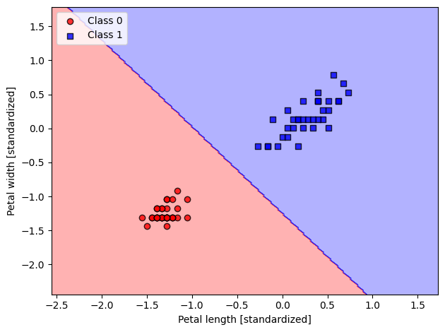
Training a logistic regression model with scikit-learn
The following code imports the LogisticRegression class from the sklearn.linear_model module and creates an instance of the class named lr.
The model is trained on the standardized training data X_train_std and y_train using the fit method. The trained model is then used to create a plot of the decision regions on the combined standardized dataset X_combined_std and y_combined, where the test examples are highlighted by their indices test_idx.
The x-axis is labeled as ‘Petal length [standardized]’ and the y-axis is labeled as ‘Petal width [standardized]’. A legend is also added to the plot and the layout of the plot is made tight to fit all the elements properly. Finally, the plot is displayed using plt.show().
from sklearn.linear_model import LogisticRegression

lr = LogisticRegression(C=100.0, solver='lbfgs')
lr.fit(X_train_std, y_train)

plot_decision_regions(X_combined_std, y_combined,
                      classifier=lr, test_idx=range(105, 150))
plt.xlabel('Petal length [standardized]')
plt.ylabel('Petal width [standardized]')
plt.legend(loc='upper left')
plt.tight_layout()
#plt.savefig('figures/03_06.png', dpi=300)
plt.show()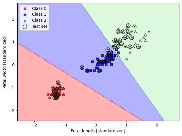
This line of code is using the predict_proba method of a Logistic Regression classifier object lr to make class predictions for the first 4 samples of the standardized test data X_test_std. The predict_proba method returns the predicted class probabilities for each sample, i.e., the estimated probability that the sample belongs to each of the possible classes. The result of the method will be a matrix of shape [4, n_classes], where n_classes is the number of classes in the target variable.
lr.predict_proba(X_test_std[:4, :])array([[9.37368464e-13, 3.91458193e-04, 9.99608542e-01],
[9.93631074e-01, 6.36892585e-03, 1.20730798e-15],
[9.98707332e-01, 1.29266792e-03, 1.82177043e-17],
[2.69051224e-06, 9.03774465e-01, 9.62228444e-02]])This line of code is computing the sum of the predicted class probabilities for each sample in the X_test_std[:3,:] array along the row axis (axis=1). The output will be an array with shape (3,) representing the total predicted probability of the samples being in any of the classes. This is useful when the sum of predicted probabilities is equal to one, which can indicate that the model’s prediction is well-calibrated.
lr.predict_proba(X_test_std[:3, :]).sum(axis=1)array([1., 1., 1.])The code lr.predict_proba(X_test_std[:3, :]).argmax(axis=1) returns the class label indices of the maximum predicted probability for the samples in X_test_std[:3, :]. This can be seen as a prediction of the class labels for the first three samples in the standardized test set. The argmax function returns the indices of the maximum values along the specified axis, which is set to axis=1 to return the indices of the maximum values for each sample.
lr.predict_proba(X_test_std[:3, :]).argmax(axis=1)array([2, 0, 0])The line lr.predict(X_test_std[:3, :]) uses the trained logistic regression model lr to predict the class labels of the first three samples in the standardized test dataset X_test_std. The predict method outputs the class label predictions as a 1D numpy array.
lr.predict(X_test_std[:3, :])array([2, 0, 0])This line of code is using the trained Logistic Regression model lr to make a single prediction for the first sample of the standardized test data X_test_std[0, :]. The sample is first reshaped into a 2D array with a single row using the reshape method (reshape(1, -1)), as the predict method expects a 2D array as input. The resulting prediction is the class label that the model assigns to this sample based on the decision boundaries learned during the training phase.
lr.predict(X_test_std[0, :].reshape(1,-1))array([2])lr.predict(X_test_std[0, :].reshape(1, -1))array([2])The value -1 in the reshape method indicates that the size of that dimension should be inferred automatically based on the total size of the tensor and the size of the remaining dimensions.
For example, if you have a one-dimensional array a with shape (10,), you can use a.reshape(-1, 1) to convert it into a two-dimensional array with shape (10, 1). Similarly, you can use a.reshape(1, -1) to convert it into a two-dimensional array with shape (1, 10). The size of the first dimension is set to 1, and the size of the second dimension is inferred to be 10.
import numpy as np

# Let's say we have an array with shape (3, 4)
arr = np.array([[1, 2, 3, 4],
                [5, 6, 7, 8],
                [9, 10, 11, 12]])

# If we want to reshape the array into a 2-dimensional array with shape (6, 2),
# we can specify the new shape as (6, 2) in the `reshape` method
arr_reshaped = arr.reshape(6, 2)
print("Array after reshaping: \n", arr_reshaped)

# If we only know that we want the first dimension to have shape 6, but
# don't know the exact number of columns, we can use -1 in the second argument
# of the `reshape` method. Numpy will automatically compute the number of columns
# based on the original shape of the array and the specified number of rows
arr_reshaped = arr.reshape(6, -1)
print("Array after reshaping: \n", arr_reshaped)
Array after reshaping:
[[ 1 2]
[ 3 4]
[ 5 6]
[ 7 8]
[ 9 10]
[11 12]]
Array after reshaping:
[[ 1 2]
[ 3 4]
[ 5 6]
[ 7 8]
[ 9 10]
[11 12]]
Tackling overfitting via regularization
import os, urllib.request
os.makedirs('figures', exist_ok=True)
fig_path = 'figures/03_07.png'
if not os.path.exists(fig_path):
    url = 'https://raw.githubusercontent.com/rasbt/machine-learning-book/main/ch03/figures/03_07.png'
    try:
        urllib.request.urlretrieve(url, fig_path)
    except Exception as e:
        print(f'Could not download figure: {e}')
if os.path.exists(fig_path):
    display(Image(filename=fig_path, width=700))
weights, params = [], []
for c in np.arange(-5, 5):
    lr = LogisticRegression(C=10.**c,)
    lr.fit(X_train_std, y_train)
    weights.append(lr.coef_[1])
    params.append(10.**c)

weights = np.array(weights)
plt.plot(params, weights[:, 0],
         label='Petal length')
plt.plot(params, weights[:, 1], linestyle='--',
         label='Petal width')
plt.ylabel('Weight coefficient')
plt.xlabel('C')
plt.legend(loc='upper left')
plt.xscale('log')
#plt.savefig('figures/03_08.png', dpi=300)
plt.show()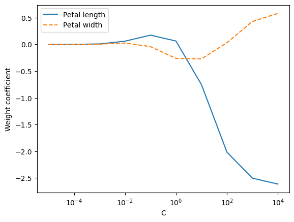
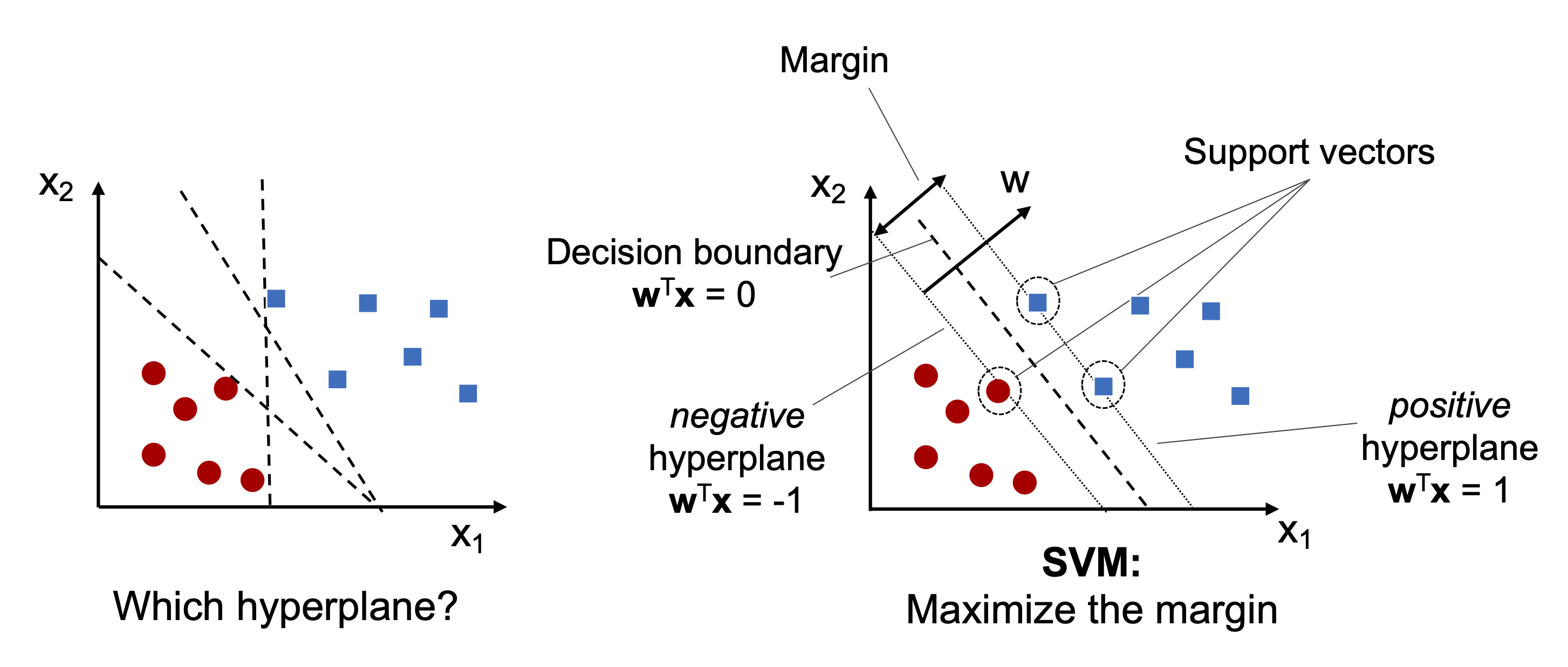
Maximum margin classification with support vector machines
import os, urllib.request
os.makedirs('figures', exist_ok=True)
fig_path = 'figures/03_09.png'
if not os.path.exists(fig_path):
    url = 'https://raw.githubusercontent.com/rasbt/machine-learning-book/main/ch03/figures/03_09.png'
    try:
        urllib.request.urlretrieve(url, fig_path)
    except Exception as e:
        print(f'Could not download figure: {e}')
if os.path.exists(fig_path):
    display(Image(filename=fig_path, width=700))
Maximum margin intuition
...
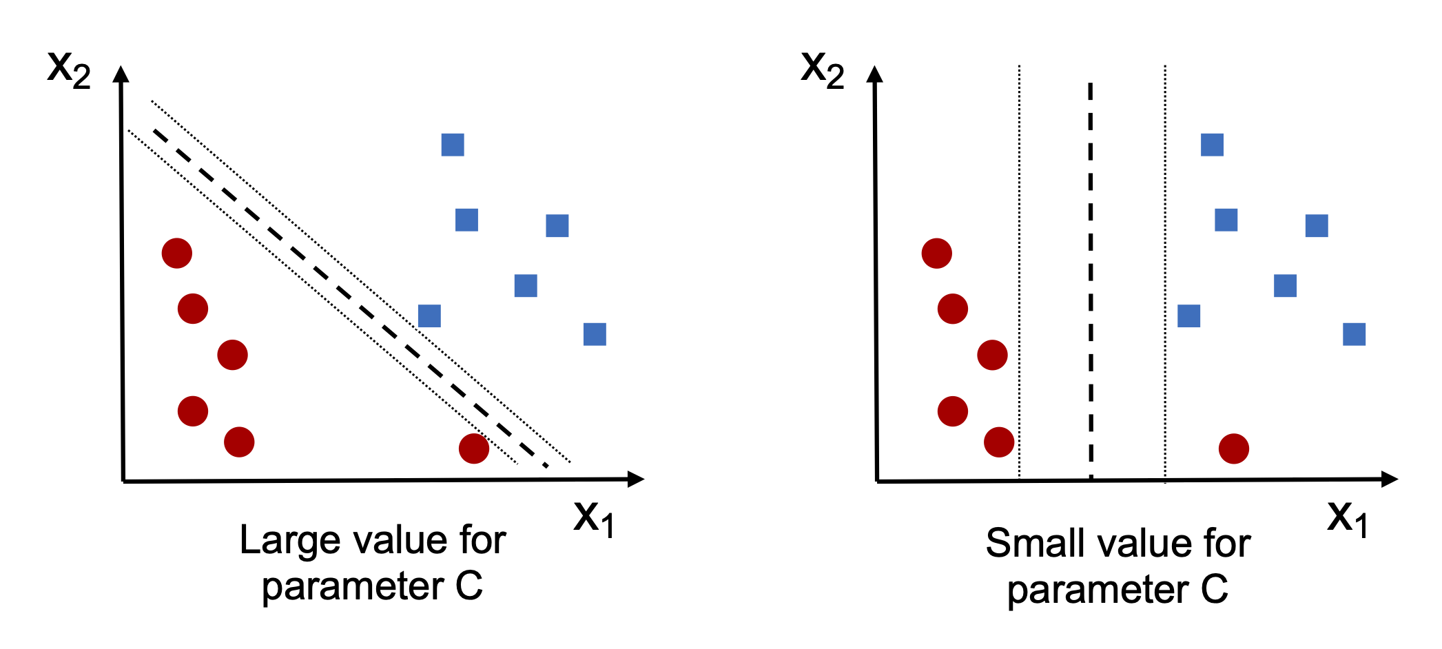
Dealing with the nonlinearly separable case using slack variables
import os, urllib.request
os.makedirs('figures', exist_ok=True)
fig_path = 'figures/03_10.png'
if not os.path.exists(fig_path):
    url = 'https://raw.githubusercontent.com/rasbt/machine-learning-book/main/ch03/figures/03_10.png'
    try:
        urllib.request.urlretrieve(url, fig_path)
    except Exception as e:
        print(f'Could not download figure: {e}')
if os.path.exists(fig_path):
    display(Image(filename=fig_path, width=600))
This code imports the SVM (Support Vector Machine) classifier from scikit-learn library, and creates an instance of the classifier with a linear kernel, C=1.0, and random_state=1. The fit method trains the SVM on the standardized training data. Then, the function plot_decision_regions is used to visualize the decision boundary and how well the SVM classifier separates the classes in the combined dataset (training and test data). The axes of the plot are labeled as “Petal length [standardized]” and “Petal width [standardized]”, and the legend is located in the upper left corner. The plot is displayed using the show method.
from sklearn.svm import SVC

svm = SVC(kernel='linear', C=1.0, random_state=1)
svm.fit(X_train_std, y_train)

plot_decision_regions(X_combined_std,
                      y_combined,
                      classifier=svm,
                      test_idx=range(105, 150))
plt.xlabel('Petal length [standardized]')
plt.ylabel('Petal width [standardized]')
plt.legend(loc='upper left')
plt.tight_layout()
#plt.savefig('figures/03_11.png', dpi=300)
plt.show()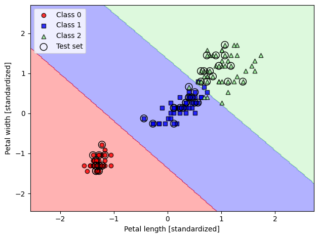
Alternative implementations in scikit-learn
In this code, three classifiers are being created: a perceptron, a logistic regression, and a support vector machine (SVM). The classifiers are being created using the SGDClassifier class from the scikit-learn library, which is an implementation of stochastic gradient descent (SGD) for linear classification models. The loss parameter is used to specify the type of loss function that the classifier should use. For the perceptron, the 'perceptron' loss function is specified, which is the standard loss function for the perceptron algorithm. For logistic regression, the 'log' loss function is specified, which corresponds to the logistic loss function. Finally, for the SVM, the 'hinge' loss function is specified, which is the standard loss function for the hinge loss SVM algorithm.
from sklearn.linear_model import SGDClassifier

ppn = SGDClassifier(loss='perceptron')
lr = SGDClassifier(loss='log_loss')
svm = SGDClassifier(loss='hinge')
svm.fit(X_train_std, y_train)
plot_decision_regions(X_combined_std,
y_combined,
classifier=svm,
test_idx=range(105, 150))
plt.xlabel('Petal length [standardized]')
plt.ylabel('Petal width [standardized]')
plt.legend(loc='upper left')
plt.tight_layout()
#plt.savefig('figures/03_11.png', dpi=300)
plt.show()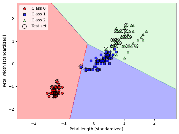
Solving non-linear problems using a kernel SVM
This code creates a scatter plot that visualizes a synthetic dataset, generated using the numpy library, where the samples belong to two classes. The samples are generated using the np.random.randn method and are stored in the X_xor numpy array. The class labels are assigned based on the logical XOR of the two features of each sample, stored in the y_xor numpy array. The scatter plot visualizes the samples from class 1 as square markers and the samples from class 0 as circle markers. The plot limits are set to [-3, 3] for both the x- and y-axis, and the x- and y-axis are labeled as “Feature 1” and “Feature 2”, respectively. The plot includes a legend to distinguish the two classes.
# Import the necessary libraries
import matplotlib.pyplot as plt
import numpy as np

# Set the random seed for reproducibility
np.random.seed(1)

# Generate XOR data
X_xor = np.random.randn(200, 2)
y_xor = np.logical_xor(X_xor[:, 0] > 0,
                       X_xor[:, 1] > 0)
y_xor = np.where(y_xor, 1, 0)


# Plot the XOR data
plt.scatter(X_xor[y_xor == 1, 0],
            X_xor[y_xor == 1, 1],
            c='royalblue',
            marker='s',
            label='Class 1')
plt.scatter(X_xor[y_xor == 0, 0],
            X_xor[y_xor == 0, 1],
            c='tomato',
            marker='o',
            label='Class 0')

# Set the x and y axis limits
plt.xlim([-3, 3])
plt.ylim([-3, 3])
plt.xlabel('Feature 1')
plt.ylabel('Feature 2')

# Add a legend
plt.legend(loc='best')

# Adjust the plot layout

plt.tight_layout()
#plt.savefig('figures/03_12.png', dpi=300)

# Show the plot
plt.show()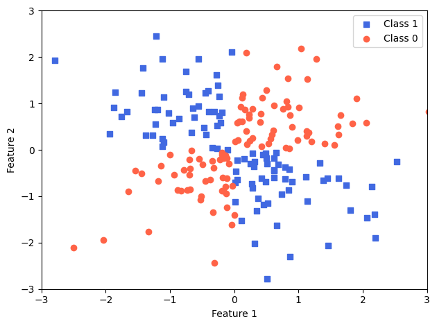
import os, urllib.request
os.makedirs('figures', exist_ok=True)
fig_path = 'figures/03_13.png'
if not os.path.exists(fig_path):
    url = 'https://raw.githubusercontent.com/rasbt/machine-learning-book/main/ch03/figures/03_13.png'
    try:
        urllib.request.urlretrieve(url, fig_path)
    except Exception as e:
        print(f'Could not download figure: {e}')
if os.path.exists(fig_path):
    display(Image(filename=fig_path, width=700))
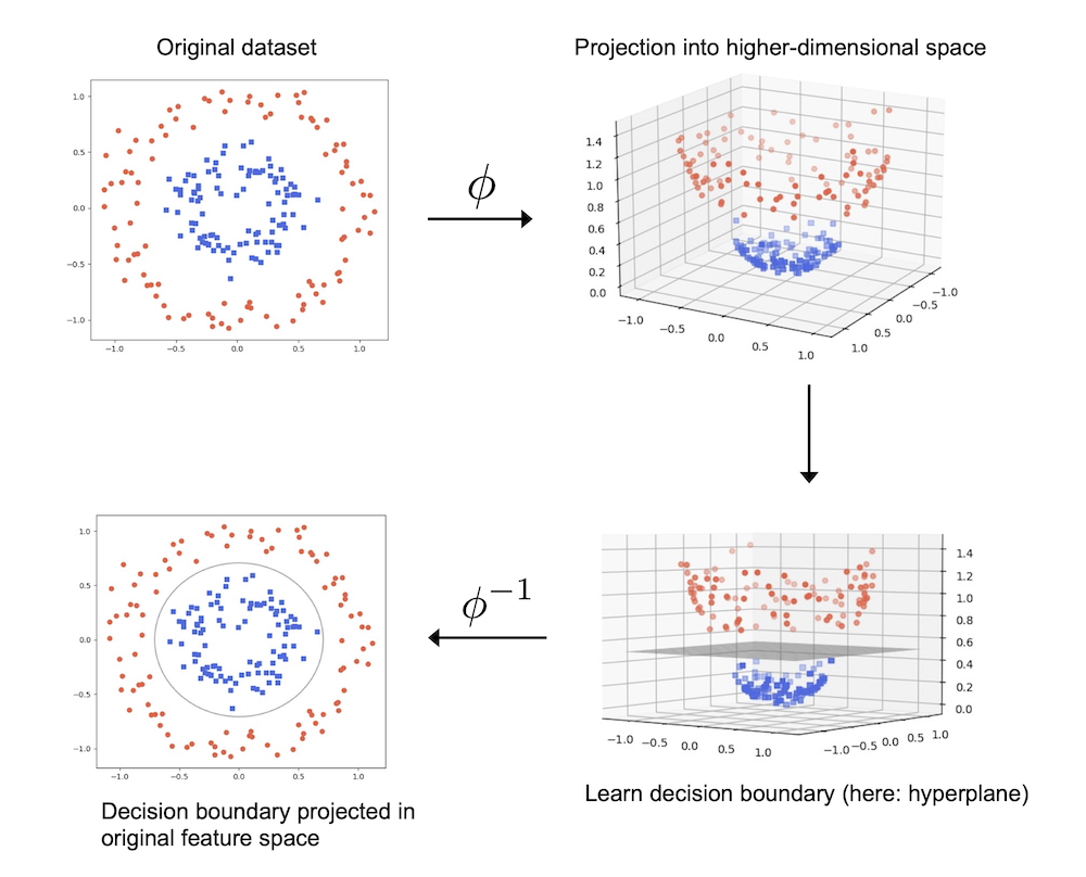
Using the kernel trick to find separating hyperplanes in higher dimensional space
This code trains a radial basis function (RBF) support vector machine (SVM) model using the scikit-learn library. The SVC class is imported from the sklearn.svm module, and an instance of the class is created with the kernel parameter set to 'rbf' to specify that the RBF kernel should be used. The random_state parameter is set to 1 to ensure that the same random seed is used every time the code is run, which makes the results reproducible. The gamma parameter controls the width of the Gaussian RBF kernel and is set to 0.1, and the C parameter controls the regularization strength and is set to 10.0. The fit method is then called to train the model using the training data, X_xor, and the corresponding class labels, y_xor. Finally, the trained model is used to make predictions on the data and visualize the decision boundary using the plot_decision_regions function. The legend function is used to add a legend to the plot, and the tight_layout function is used to optimize the layout of the plot. The show function is called to display the plot.
svm = SVC(kernel='rbf', random_state=1, gamma=0.10, C=10.0)
svm.fit(X_xor, y_xor)
plot_decision_regions(X_xor, y_xor,
                      classifier=svm)

plt.legend(loc='upper left')
plt.tight_layout()
#plt.savefig('figures/03_14.png', dpi=300)
plt.show()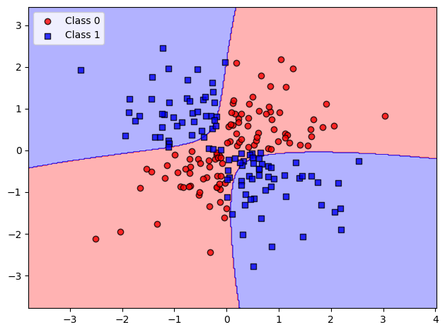
The code imports the SVC (Support Vector Classification) class from the scikit-learn library, creates an instance of the class, and trains the model on the training data (X_train_std and y_train). The kernel argument is set to 'rbf' which stands for radial basis function, a common choice for non-linear problems. The gamma and C arguments set the width of the Gaussian radial basis function (gamma) and the regularization parameter (C), respectively.
The fit method trains the SVM model on the training data. The plot_decision_regions function is then used to visualize the decision boundaries of the trained model. The X_combined_std and y_combined input arguments represent the feature and target variables of the entire dataset (both training and test data), while the test_idx argument indicates which samples belong to the test set.
Finally, the plot is labeled with x and y-axis labels and a legend, and is shown to the user.
from sklearn.svm import SVC

svm = SVC(kernel='rbf', random_state=1, gamma=0.2, C=1.0)
svm.fit(X_train_std, y_train)

plot_decision_regions(X_combined_std, y_combined,
                      classifier=svm, test_idx=range(105, 150))
plt.xlabel('Petal length [standardized]')
plt.ylabel('Petal width [standardized]')
plt.legend(loc='upper left')
plt.tight_layout()
#plt.savefig('figures/03_15.png', dpi=300)
plt.show()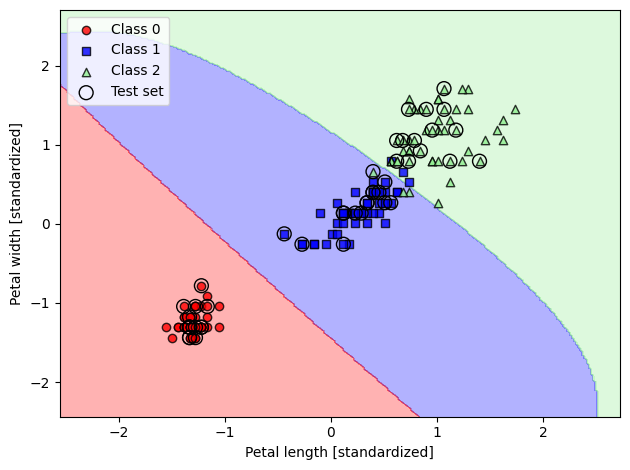
This code is creating another SVM classifier using a radial basis function (RBF) kernel, with a different value of the gamma parameter. The gamma parameter is used to control the shape of the Gaussian RBF kernel. A large gamma value creates a very narrow Gaussian that can fit tightly around individual data points, while a small gamma value creates a wider Gaussian that may not fit the data as well, but is more robust to noise.
In this example, we have set the value of gamma to 100.0, which is significantly larger than the value of 0.2 used in the previous code. This results in a much more complex model, which is likely overfitting the training data, and may not generalize well to unseen data.
The decision boundary for this new classifier is then plotted and displayed using the plot_decision_regions function.
svm = SVC(kernel='rbf', random_state=1, gamma=1.0, C=1.0)
svm.fit(X_train_std, y_train)

plot_decision_regions(X_combined_std, y_combined,
                      classifier=svm, test_idx=range(105, 150))
plt.xlabel('Petal length [standardized]')
plt.ylabel('Petal width [standardized]')
plt.legend(loc='upper left')
plt.tight_layout()
#plt.savefig('figures/03_16.png', dpi=300)
plt.show()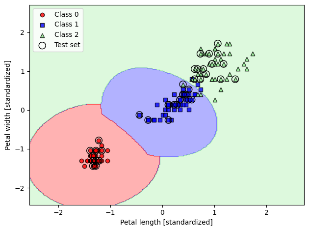
Decision tree learning
import os, urllib.request
os.makedirs('figures', exist_ok=True)
fig_path = 'figures/03_17.png'
if not os.path.exists(fig_path):
    url = 'https://raw.githubusercontent.com/rasbt/machine-learning-book/main/ch03/figures/03_17.png'
    try:
        urllib.request.urlretrieve(url, fig_path)
    except Exception as e:
        print(f'Could not download figure: {e}')
if os.path.exists(fig_path):
    display(Image(filename=fig_path, width=500))
def entropy(p):
    return - p * np.log2(p) - (1 - p) * np.log2((1 - p))

x = np.arange(0.0, 1.0, 0.01)
ent = [entropy(p) if p != 0 else None
       for p in x]

plt.ylabel('Entropy')
plt.xlabel('Class-membership probability p(i=1)')
plt.plot(x, ent)
#plt.savefig('figures/03_26.png', dpi=300)
plt.show()
import os, urllib.request
os.makedirs('figures', exist_ok=True)
fig_path = 'figures/03_18.png'
if not os.path.exists(fig_path):
    url = 'https://raw.githubusercontent.com/rasbt/machine-learning-book/main/ch03/figures/03_18.png'
    try:
        urllib.request.urlretrieve(url, fig_path)
    except Exception as e:
        print(f'Could not download figure: {e}')
if os.path.exists(fig_path):
    display(Image(filename=fig_path, width=500))
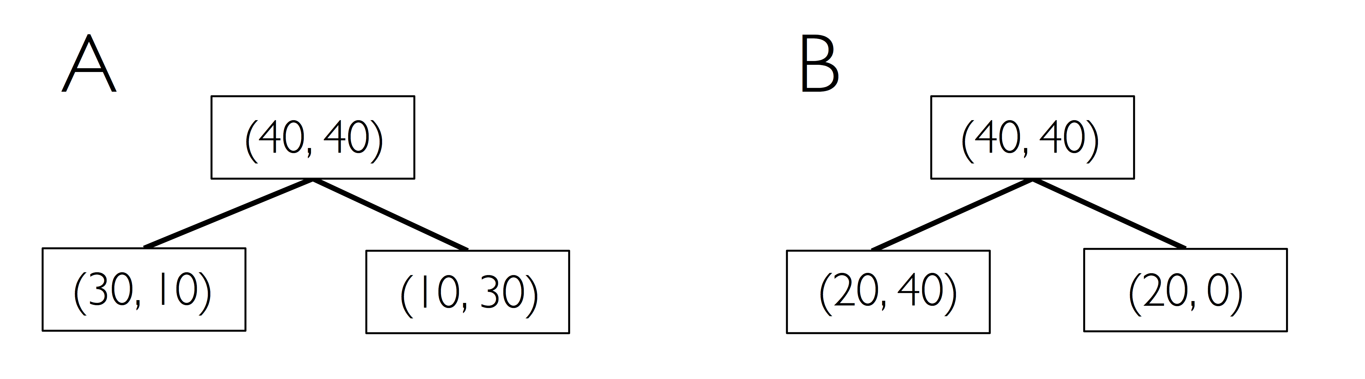
Maximizing information gain - getting the most bang for the buck
import matplotlib.pyplot as plt
import numpy as np


def gini(p):
    return p * (1 - p) + (1 - p) * (1 - (1 - p))


def entropy(p):
    return - p * np.log2(p) - (1 - p) * np.log2((1 - p))


def error(p):
    return 1 - np.max([p, 1 - p])

x = np.arange(0.0, 1.0, 0.01)

ent = [entropy(p) if p != 0 else None for p in x]
sc_ent = [e * 0.5 if e else None for e in ent]
err = [error(i) for i in x]

fig = plt.figure()
ax = plt.subplot(111)
for i, lab, ls, c, in zip([ent, sc_ent, gini(x), err],
                          ['Entropy', 'Entropy (scaled)',
                           'Gini impurity', 'Misclassification error'],
                          ['-', '-', '--', '-.'],
                          ['black', 'lightgray', 'red', 'green', 'cyan']):
    line = ax.plot(x, i, label=lab, linestyle=ls, lw=2, color=c)

ax.legend(loc='upper center', bbox_to_anchor=(0.5, 1.15),
          ncol=5, fancybox=True, shadow=False)

ax.axhline(y=0.5, linewidth=1, color='k', linestyle='--')
ax.axhline(y=1.0, linewidth=1, color='k', linestyle='--')
plt.ylim([0, 1.1])
plt.xlabel('p(i=1)')
plt.ylabel('Impurity index')
#plt.savefig('figures/03_19.png', dpi=300, bbox_inches='tight')
plt.show()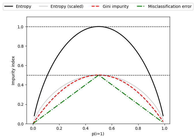
Building a decision tree
from sklearn.tree import DecisionTreeClassifier

tree_model = DecisionTreeClassifier(criterion='gini',
                                    max_depth=4,
                                    random_state=1)
tree_model.fit(X_train, y_train)

X_combined = np.vstack((X_train, X_test))
y_combined = np.hstack((y_train, y_test))
plot_decision_regions(X_combined, y_combined,
                      classifier=tree_model,
                      test_idx=range(105, 150))

plt.xlabel('Petal length [cm]')
plt.ylabel('Petal width [cm]')
plt.legend(loc='upper left')
plt.tight_layout()
#plt.savefig('figures/03_20.png', dpi=300)
plt.show()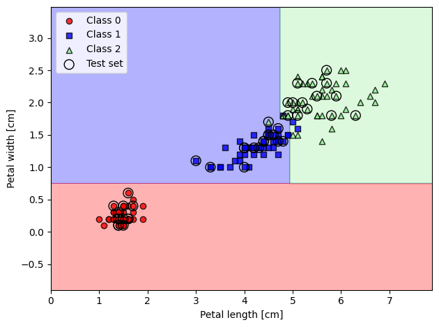
from sklearn import tree

feature_names = ['Sepal length', 'Sepal width',
                 'Petal length', 'Petal width']
tree.plot_tree(tree_model,
               feature_names=feature_names,
               filled=True)

#plt.savefig('figures/03_21_1.pdf')
plt.show()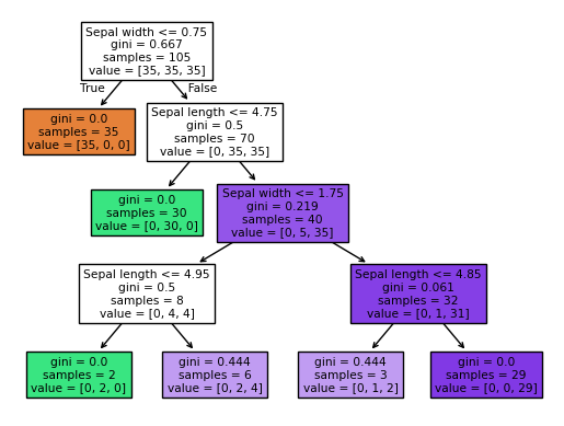
Combining weak to strong learners via random forests
from sklearn.ensemble import RandomForestClassifier

forest = RandomForestClassifier(n_estimators=25,
                                random_state=1,
                                n_jobs=2)
forest.fit(X_train, y_train)

plot_decision_regions(X_combined, y_combined,
                      classifier=forest, test_idx=range(105, 150))

plt.xlabel('Petal length [cm]')
plt.ylabel('Petal width [cm]')
plt.legend(loc='upper left')
plt.tight_layout()
#plt.savefig('figures/03_2.png', dpi=300)
plt.show()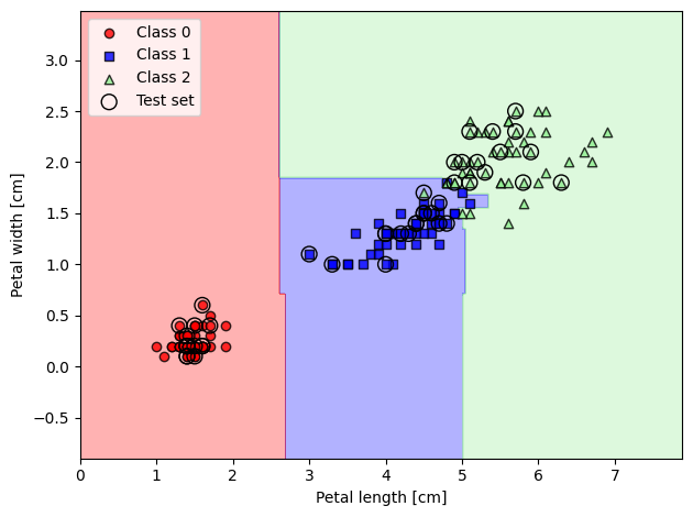
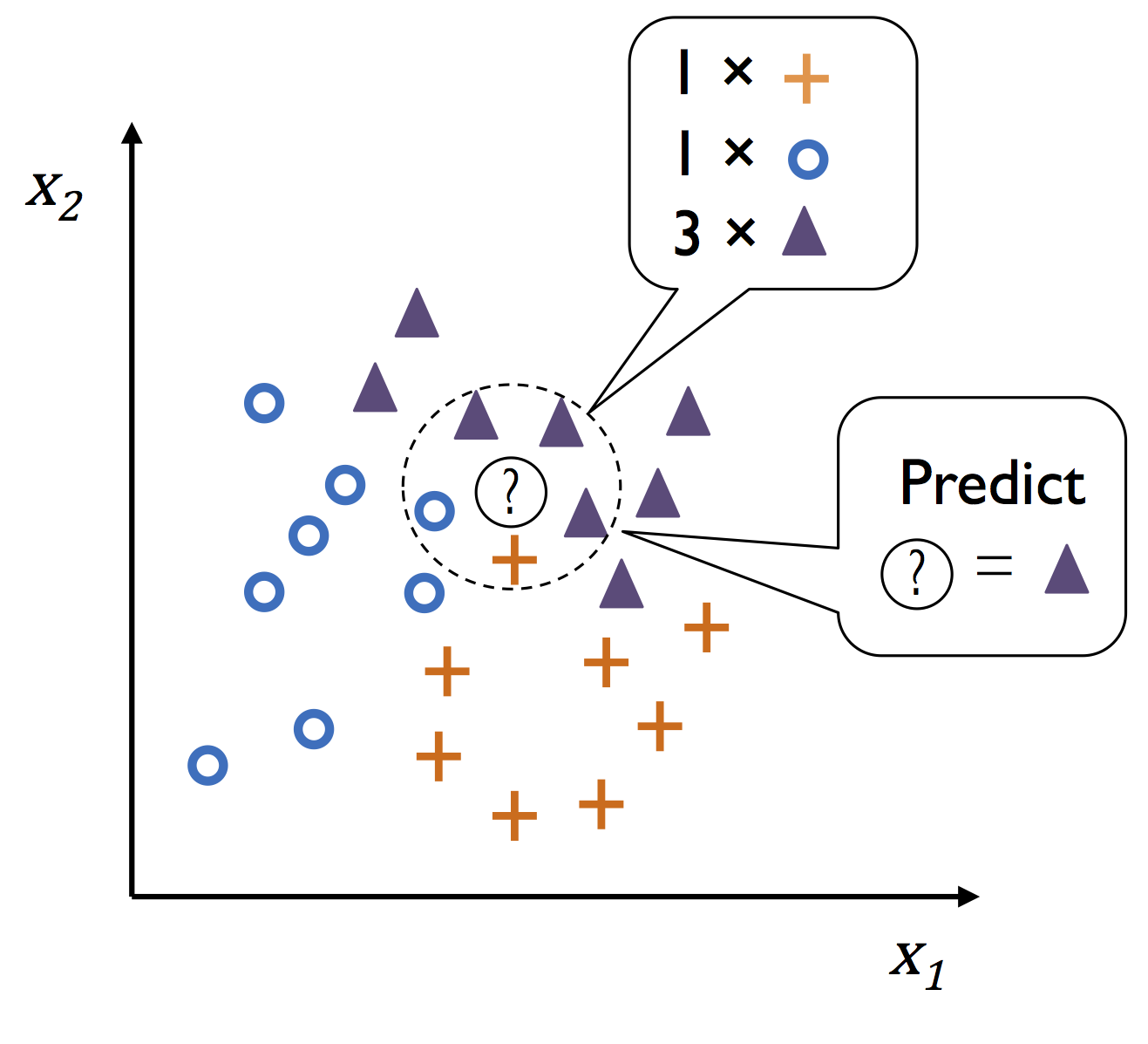
K-nearest neighbors - a lazy learning algorithm
import os, urllib.request
os.makedirs('figures', exist_ok=True)
fig_path = 'figures/03_23.png'
if not os.path.exists(fig_path):
    url = 'https://raw.githubusercontent.com/rasbt/machine-learning-book/main/ch03/figures/03_23.png'
    try:
        urllib.request.urlretrieve(url, fig_path)
    except Exception as e:
        print(f'Could not download figure: {e}')
if os.path.exists(fig_path):
    display(Image(filename=fig_path, width=400))
from sklearn.neighbors import KNeighborsClassifier

knn = KNeighborsClassifier(n_neighbors=5,
                           p=2,
                           metric='minkowski')
knn.fit(X_train_std, y_train)

plot_decision_regions(X_combined_std, y_combined,
                      classifier=knn, test_idx=range(105, 150))

plt.xlabel('Petal length [standardized]')
plt.ylabel('Petal width [standardized]')
plt.legend(loc='upper left')
plt.tight_layout()
#plt.savefig('figures/03_24_figures.png', dpi=300)
plt.show()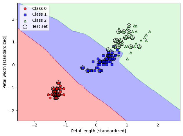
Summary
...
Readers may ignore the next cell.
# Optional utility script from the book's own repo (not included here) that
# converts this notebook to a .py file. Skipped safely when not present.
import os
script = '../.convert_notebook_to_script.py'
if os.path.exists(script):
    get_ipython().system('python {script} --input ch03-BAJ.ipynb --output ch03-BAJ.py')
else:
    print('Skipping: convert_notebook_to_script.py not present in this environment.')
Skipping: convert_notebook_to_script.py not present in this environment.